Key to the data classes file (providex.dcl). When entering a new data class name, spaces are not allowed. Maximum length is 30 characters.
Click the Query button (binoculars) for a list of defined data classes (if any). Click the Browse buttons to browse to existing data classes. Click the Copy Class button to copy an existing data class to a new data class. If unsaved changes are detected when selecting these buttons, a message will display to save the changes.
(First/Last Class browse buttons were added in PxPlus 2019.)
(Add/Edit Notes)
(Available when a new or existing data Class Name is entered or selected)
Button used to add (or edit) notes for a new or existing data class. Maximum 1024 characters. The button's appearance and tooltip change to indicate that a note was added for the data class.
(The Add/Edit Notes button was added in PxPlus 2022.)
(Copy Class)
(Available when an existing data Class Name is selected)
Button used to create a new data class by copying the settings from an existing data class. Once it is created, the new data class must be saved, as the Copy process does not do this.
(The Copy Class button was added in PxPlus 2019.)
Last Class Change
This information is updated automatically whenever a change is made to the data class definition.
(Last Class Change was added in PxPlus 2023.)
Control Type
Default control type used to represent the data that belongs to your defined data class. Click the drop-down arrow for a list of selections: Multi Line, Drop Box, List Box, Radio Buttons, Check Box. (Default is Multi Line.)
Generic description of the data class (Fixed value, Expression or Message Library Reference). This will be copied to the data dictionary when the data class is applied to an element. See Element Description.
*Dynamic
For new data classes created in PxPlus 2018, this check box is selected by default.
For data classes created prior to PxPlus 2018, this check box is not selected by default.
Select this check box to set dynamic control properties to Dynamic automatically when the data class is entered for a control in the Panel Designer. If Dynamic is not selected, dynamic control properties must be set to Dynamic manually after entering the data class for a control. See Dynamic Control Properties.
(The Dynamic check box was added in PxPlus 2018.)
Internal Data Type
Internal format of the data when manipulated by a program, either String or Numeric. (Default is String.)
Internal Size
Maximum size of the stored data element.
If the Internal Data Type is for a String variable, the Internal Size value will define the maximum string length. For a Numeric variable, enter nnn.dd where nnn is the maximum number of digits (including the decimal) and dd is the number of digits after the decimal point (i.e. the PRECISION of the number).
If the selected Control Type is Radio Buttons or Check Box, the Internal Size is 1.
Display( * indicates a Dynamic property)
Properties
Drop Box Width
Width of the control in number of columns - numeric expression. Format mask is ##0.00 and valid entries are 0 to 255.
Drop Box Height
Height of the control in number of lines - numeric expression. Format mask is ##0.00 and valid entries are 0 to 240.
*Display Format
Format mask to use when a multi-line is substituted for the drop box when generating a File Maintenance panel.
(Display Format was added in PxPlus 2021.)
*List Values
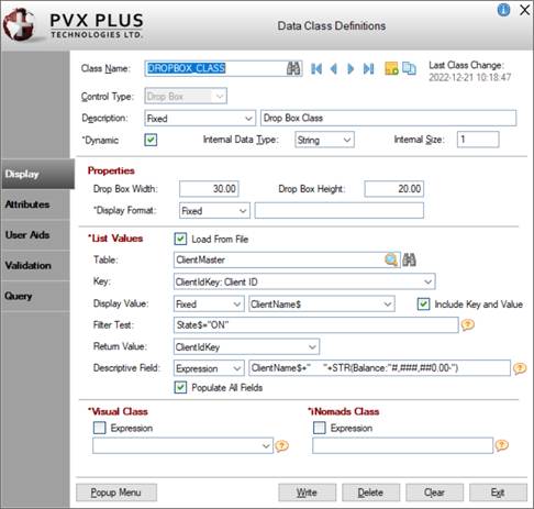
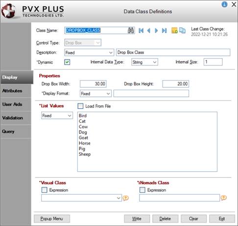
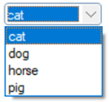
List of values that NOMADS uses to preload the drop box. Can be a Fixed value or a string Expression. A data table/file can also be used.
Select this check box to define a data table/file as the source when populating a drop box at run time. See Populate from Data Source.
(The Load From File check box was added in PxPlus 2019.)
Table
(Available when Load From File check box is selected)
Name of the data table/file. When a valid table/file is entered, the Key and Return Value fields are populated.
Click the Query Table View button (magnifying glass) for a tree view of table names by Group. For information on creating a filter to locate a specific table name, see Filtering the Table Names Lookup.
Click the Query button (binoculars) for a query view of tables by table name. For information on using the query features (i.e. search, sort, filter, etc.), see Run-Time Query.
Key
(Available when a Table is selected)
Key definition to use to read the selected Table. Defaults to the Primary key when a Table is entered. This key controls the sort sequence for the drop box values.
If no Display Value is specified, the values for the selected Key will be loaded into the drop box.
Display Value
(Available when a Table is selected)
(Optional) Specify a display value (either Fixed or Expression) to use to load the drop box or leave blank.
If no Display Value is specified, the Key values will be used to load the drop box.
Fixed
Select an element whose values will be used to load the drop box instead of the Key values.
Click the drop-down arrow for a list of string elements in the selected Table. This list includes numeric elements (if defined), which display either as =STR(value:"format") or =STR(value), depending on whether a Display format mask was defined for the numeric element in the Data Dictionary.
Examples:
=STR(ytdSales:"##,###,##0.00")
With Display format mask ##,###,##0.00
=STR(QtyOnHand)
Without a Display format mask
If a numeric element is selected when the data class is saved, the Display Value drop box will show Expression the next time this data class is accessed.
Expression
Enter an expression for the values to load in the drop box.
The expression will be evaluated while loading the drop box. Only variables available to the %nomads'class object may be used, which includes any columns from the Load From File Table or global variables or any system-wide variables. Constant string values may also be used.
Examples:
ClientCode$+'': ''+ClientName$
Address1$+'' / ''+Address2$+'' / ''+Address3$
''Date = ''+DTE(InvoiceDate$:%Dl %Ml %D/%Y)
(The ability to use numeric elements and specify an Expression was added in PxPlus 2020.)
Include Key and Value
(Available when Display Value is Fixed and a non-numeric element is selected)
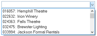
(Optional) Select this check box to use both the Key value and the Display Value to load the drop box in the following format: Keyvalue: DisplayValue. (By default, this check box is not selected.)
Example:
If the Key is ClientIDKey:Client ID and the Display Value is ClientName$, the drop box will load using both these values:
Filter Test
(Available when a Table is selected)
(Optional) Enter an expression to filter the records that will be loaded in the drop box if the expression is evaluated as True.
Examples:
UCS(DepartmentCode$)=''EAST''
MID(ProductCode$,1,3)=''CAR''
ytdSales>0
(Filter Test option was added in PxPlus 2020.)
Return Value
(Available when a Table is selected)
Select the return value when an entry is selected from the drop box. This value is used to define the Translation table for the drop box.
Click the drop-down arrow for a list of defined Key values for the selected Table. Defaults to the Primary key when a Table is entered.
If an element is selected for the Display Value, then "Drop Box Display Value" will be added as an available selection to the top of the Return Value drop-down list.
Descriptive Field
(Available when a Table is selected)
(Optional) Specify a descriptive field (either Fixed or Expression) to allow it to be available when creating display-only Multi-Line controls in the NOMADS Panel Designer. See Extended Class Browse.
Fixed
Click the drop-down arrow to select from a list of string elements in the selected Table. This list includes numeric elements (if defined), which display either as =STR(value:"format") or =STR(value), depending on whether a Display format mask was defined for the numeric element in the Data Dictionary.
Examples:
=STR(ytdSales:"##,###,##0.00")
With Display format mask ##,###,##0.00
=STR(QtyOnHand)
Without a Display format mask
If a numeric element is selected when the data class is saved, the Descriptive Field drop box will show Expression the next time this data class is accessed.
Expression
Enter an expression to populate the value in the Multi-Line control when making a selection from the drop box. The expression will be evaluated while validating the data. Only variables available to the %nomads'class object may be used, which includes any columns from the Load From File Table or global variables or any system-wide variables. Constant string values may also be used.
Examples:
ClientCode$+': '+ClientName$
'Date = '+DTE(InvoiceDate$:%Dl %Ml %D/%Y)
SalespersonCode$+SEP+SalespersonName$ (see Note)
(Descriptive Field option for Drop Box data classes was added in PxPlus 2020.)
Populate All Fields
(Available when a Descriptive Field is entered or selected)
Select this check box to allow all data elements in the selected Table to be available when creating display-only Multi-Line controls in the NOMADS Panel Designer.
(Populate All Fields option for Drop Box data classes was added in PxPlus 2020.)
The iNomads class contains class attribute references used when defining the control in the HTML code generated in iNomads. An iNomads class reference must start with an alpha character (A-Z or a-z), followed by any combination of A-Z, a-z, 0-9, underscore or dash. Multiple references may be entered, separated by a space. For a list of pre-defined iNomads classes, see iNomads Classes.
(added in PxPlus 2018)
Attributes( * indicates a Dynamic property)
Attributes
Auto Tab Skip
Control is skipped when tabbing forward but is still accessible via Shift - Tab or the mouse.
Initially Disabled
Control region is grayed out and is not accessible to the user for input. The control is accessible programmatically.
Initially Hidden
Control is not displayed but is accessible programmatically.
Borderless
The control is drawn with no border or frame.
Strip Trailing Spaces
Strips trailing spaces when reading/writing data for control.
Signal On Exit
A signal is generated when focus leaves the control whether the selection or value has changed or not. NOMADS will execute the On Change logic.
Enable Scrolling
Allows the control to scroll in a resizable/scrollable dialogue box. See Panel Resizing.
Automatic (Signal All Changes)
A signal is returned on any changes in the control.
Disable On Empty
The system automatically disables the drop box when it contains no entries. When populated, the drop box is re-enabled. Overridden when the 'Enabled property is turned Off. Default is Off. (added in PxPlus 2018)
Ignore Change Flag
Select this check box when you do not want the NOMADS CHANGE_FLG variable to be updated when the control value is changed. (added in PxPlus 2017)
Drop Box Attributes
Allow Variable Input
Enables the user to select any element from the list or enter any other value.
Input Length
(Applicable when Allow Variable Input check box is selected) Maximum input characters. Can be Fixed or numeric Expression.
Corner Radius
Sets the radius for the drop box corners. Works only in 4D mode.
Possible values are Null (blank), Round, Square or a value from 0 to 3 inclusive. See CornerRadius$ property.
Click the drop-down arrow for a list of selections:
Default
Set via global variable
Always
On, overriding global activation
Never
Off, overriding global activation
*User Tag Field
For controls, data/tag field which can be used to pass information on such things as formatting, error messages or validation rules. Field contents are placed in a variable using the control name with a .TAG$ extension.
Alt-Key
Hot key for the control. Click the drop-down arrow for a list of selections. (added in PxPlus 2018)
User Aids( * indicates a Dynamic property)
*Help Reference
Type
Click the drop-down arrow to select either Internal or External help reference:
Internal
Application supplied message text (Fixed value, string Expression or Message Library Reference).
External
Standard Windows help system consisting of a help file name and an optional keyword or reference number (Fixed or Expression).
*Floating Tip
Mouse pointer message for the control (Fixed value, string Expression or Message Library Reference).
You can customize the floating tip by adding a tip title, descriptive tip text and a hyperlink. These features enhance the visual display and functionality of the tip by providing users with much needed information at their fingertips. You can define either a Standard tip or an HTML tip that provides a simplified HTML Editor for customizing the tip text. To do this, click the button to the right of the Floating Tip multi-line input to invoke the Define Info Tip dialogue. See Defining an Info Tip.
*Message Bar
Text to be displayed in the panel's status bar when focus is on the control (Fixed value, string Expression or Message Library Reference).
Validation( * indicates a Dynamic property)
*Default Setting
Initial value to be highlighted when the drop box is drawn (Fixed value or string Expression).
*Translation
Click the Translate check box to set up a table of values representing drop box selections. Definition consists of a Table Value Length (length of each of the items in the table) and the translation value (Fixed or string Expression).
If the Dynamic check box is selected and the Load From File option is defined, the translation value will be set to Expression, the Table Value Length will be set to 0, and both will be locked.
(The setting of translation values for dynamic Drop Box data classes with Load From File functionality was added in PxPlus 2021.)
Query( * indicates a Dynamic property)
*Query Type
Type of query to associate to the control: Panel, Query Program, Non-Query Logic. Valid formats include a NOMADS query object or query list, a custom query panel, or user-supplied query program.
Depending on the Query Type selected, different information is entered. For an explanation of each type and the information to enter, see Query Type.
*Panel Information
(Applicable when Query Type is Panel)
For an explanation of the information to enter, see Query Type: Panel.
The Define button uses the Panel name to either create a new or edit an existing query definition.
(The Define button was added to Data Class Definitions maintenance in PxPlus 2023 Update 1.)
(Applicable when Query Type is Panel, Query Program or Non-Query Logic)
Options that can be set to refine the appearance of the query button when a multi-line is substituted for a drop box when generating a File Maintenance panel. See Note 2 above.
Button that is used to assign a popup menu to a data class (Fixed value or Expression, to be evaluated at run time when the popup signal occurs). A check mark displayed on the button indicates that a popup menu is currently assigned to the data class. This button invokes the Assign Popup Menu window for assigning Prior Popup logic, a pre-defined popup object or user-defined program. If selected, Prior Popup logic will be executed before the popup menu is displayed. If On Select logic exists for the control with the popup menu, this will be triggered before the popup event.
Select the Panel option in the Assign Popup Menu window to display a pre-set list of popup objects available for the highlighted library. The Program option is used to add a user-defined program. This can be either a Fixed value or an Expression to be evaluated at run time when the popup signal occurs.
Write
Adds a new data class definition or updates an existing definition.
Delete
(Available when an existing data class is selected)
Removes the selected data class definition. Before proceeding, a message asks to confirm the deletion, as deleting a data class in use may cause issues.
Clear
Clears the current data class definition to allow you to define a new data class or select an existing definition.
Exit
Closes Data Class Definitions maintenance without saving any changes.