PxPlus 2026 (version 23.00), May 2026
PxPlus 2026 expands the .NET Interface and the Visual Studio Code Extension with new capabilities, adds the ability to modernize your UI with rounded controls, and updates security.
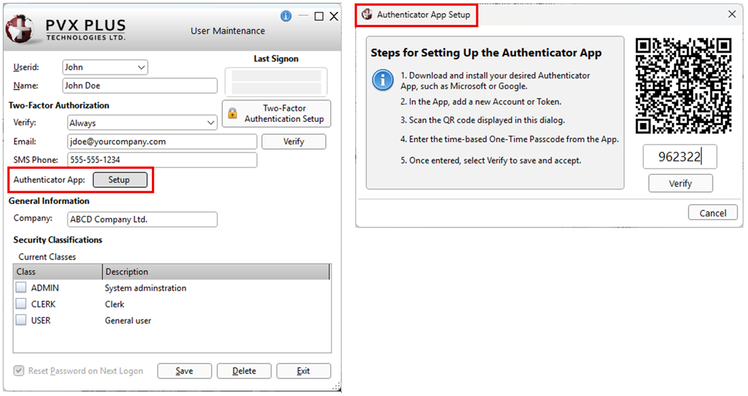
 | Staying current with the latest security is essential for protecting sensitive data and systems against constantly evolving cyber threats. PxPlus 2026 introduces enhanced security modules, along with a new Authenticator App for Two-Factor Authentication, providing an added layer of protection. |
| In PxPlus 2026, our modernization efforts continue with enhancements that bring greater visual refinement and control to PxPlus applications. Updated controls now include new properties, making it easy to create rounded, modern UI elements. |
| Building on the .NET interface introduced in 2025 and influenced by valuable feedback from our user community, PxPlus 2026 strengthens the interface with new features designed to make development, debugging, and integration simpler and more efficient. |
| Since its introduction in PxPlus 2024, the Visual Studio Code Extension continues to evolve with a robust set of new capabilities. With input from our user community, PxPlus 2026 delivers a wide range of enhancements designed to simplify and improve the development experience. Notable updates include enhanced Auto Complete functionality, improved code navigation and support for WindX plug-in connections. |
Major New Features
Updated PxPlus Security modules:
OpenSSL 3.5.6
Curl 8.19.0
Updated CA Root Certificates
Updated to the latest version of Chromium (*browser)
Updated the PxPlus SQL ODBC Driver and PxPlus SQL Server to use OpenSSL 3.5.6 and added Data Dictionary Hide Table support
Introduced new control properties, Corner Radius and Focus Rectangle, to support the creation of rounded UI elements and improve the overall visual presentation of both NOMADS and non-NOMADS applications
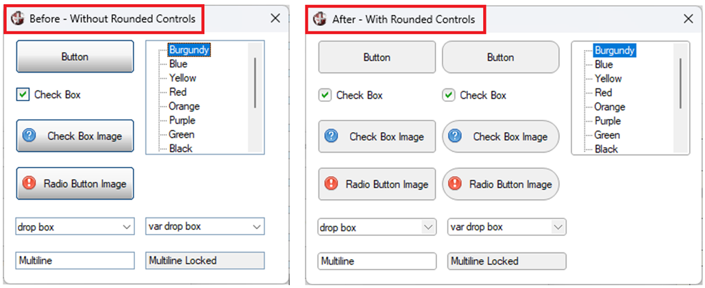
Refreshed the Light and Dark mode toolkit themes with updated visuals and new UI elements
The Copy Theme utility makes it easy to create your own customized Light and Dark themes.
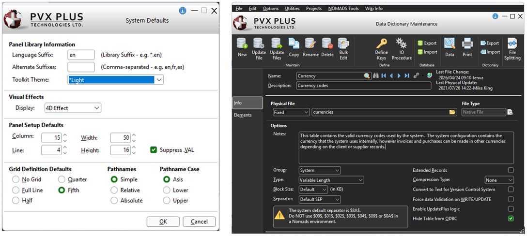
Enhanced the Visual Studio Code Extension with WindX connectivity, code navigation, expanded program tooling, and richer Auto Complete capabilities
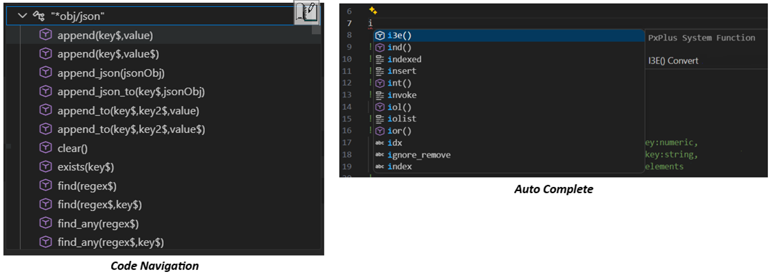
Updated the .NET Interface with new index access methods, a new array conversion utility program, the ability to select system DLLs and objects from a dialog, and improved .NET exception messaging
Added new options for creating .NET External Controls in NOMADS, making it easier to browse and select .NET components
.NET DLL Name now supports expressions
New Browse System DLLs button helps users select a DLL and object
Object Name includes a query that displays all objects for the entered DLL
Added Authenticator App verification to Two-Factor Authentication in NOMADS and iNomads
Enhancements
Directives
BUTTON, CHECK_BOX and RADIO_BUTTON directive option
Added OPT="x" setting to add a tab close button for a Button, a Check Box (with an image) and a Radio Button (with an image)
DEF_OBJECT directive enhancements
Added the ability to List Available .NET System DLLs and then Objects via "[.NET]*" and to List Available .NET Objects for the Given DLL via "[.NET]dllname,*"
Introduced new Properties and Methods to the .NET interface
MULTI_LINE directive option
Added OPT="m" setting to vertically center text
Properties
Properties can be used to specify settings for NOMADS and non-NOMADS applications.
Note: To use the new Corner Radius properties, 4D mode is required.
CBCornerRadius$ property added to support rounded corners
Check Boxes: Sets the corner radius for standard Check Box controls
Tri-State Check Boxes: Sets the corner radius for standard Tri-State Check Box controls
CornerRadius$ property added to support rounded corners for controls
Buttons: Sets the corner radius for Button controls
Check Boxes: Sets the corner radius for Check Box controls with an image
Drop Boxes: Sets the corner radius for Drop Box controls
List Boxes: Sets the corner radius for all types of List Box controls except Report View and Variable List Boxes
Multi-Lines: Sets the corner radius for Multi-Line controls
Radio Buttons: Sets the corner radius for Radio Button controls with an image
Tri-State Check Boxes: Sets the corner radius for Tri-State Check Box controls with an image
Variable Drop Boxes: Sets the corner radius for Variable Drop Box controls
FieldHeight property added for Drop Box and Variable Drop Box controls to set the height of the drop box input and drop area (in pixels)
FocusRect property added to suppress or display the dotted focus rectangle on controls (set by control type)
Buttons: Suppresses or displays the focus rectangle around the Button text
Check Boxes (with and without an image): Suppresses or displays the focus rectangle around the Check Box text
Drop Boxes: Suppresses or displays the focus rectangle around the Drop Box selected text except for Variable Drop Boxes
List Boxes: Suppresses or displays the focus rectangle around the selected row for all types of List Box controls except Variable List Boxes
Radio Buttons (with and without an image): Suppresses or displays the focus rectangle around the Radio Button text
Tri-State Check Boxes (with and without an image): Suppresses or displays the focus rectangle around the Tri-State Check Box text
OPTION Mnemonics
New Corner Radius options for creating rounded controls
CornerRadBtn: Option to set the corner radius for all Button controls
CornerRadCB: Option to set the corner radius for all standard Check Box and Tri-State Check Box controls
CornerRadCBImg: Option to set the corner radius for all Check Box controls with an image
CornerRadDB: Option to set the corner radius for all Drop Box and Variable Drop Box controls
CornerRadLB: Option to set the corner radius for all types of List Box controls except Report View and Variable List Boxes
CornerRadML: Option to set the corner radius for all Multi-Line controls
CornerRadRBImg: Option to set the corner radius for all Radio Button controls with an image
New Focus Rectangle options for suppressing or displaying the dotted focus rectangle on controls (set by control type)
FocusRectBtn: Option to suppress or display the focus rectangle for Button controls
FocusRectCB: Option to suppress or display the focus rectangle for Check Box controls and Tri-State Check Box controls (with and without an image)
FocusRectDB: Option to suppress or display the focus rectangle for Drop Box controls except Variable Drop Boxes
FocusRectLB: Option to suppress or display the focus rectangle for List Box controls except Variable List Boxes
FocusRectRB: Option to suppress or display the focus rectangle for Radio Button controls (with and without an image)
New Tab Button Close options for customizing the tab close icon
TabBtnCloseHoverIcon: Option to set the path of an icon to use when hovering over the close button on a Button, a Check Box (with an image), or a Radio Button (with an image) where OPT="x" is set
TabBtnCloseIcon: Option to set the path of an icon to use when hovering over a Button, a Check Box (with an image), or a Radio Button (with an image) where OPT="x" is set
Note: The above options can be read using the FIN( ) function.
Functions
TCB ("compiled_osver") now displays Linux/Unix operating system version
Objects
New Parse URL Object: Parses values from a specified parameter of a provided URL
*Browser Object: New method added to handle POST requests
Post(url$ [,postData$ [,headers$]]): Sends an HTTP POST request and displays the resulting web page
Array List Object: New methods added to help with data manipulation
Clone( ): Returns a handle to an array list with identical values
Get(index1, index2): Gets a subsection of the array list, returned as an array list handle
Pop( ) / Pop$( ): Gets the last value in the array list and then removes it
Print( ): Prints the string representation of the array list
Remove_range(index1, index2): Removes the values within the given range
Reverse( ): Reverses the order of the array list
Set(array): Sets array list values to that of the given array list
Shift( ) / Shift$( ): Gets the first value in the array list and then removes it
String$( ): Returns a string representation of the array list
Swap(index1, index2): Swaps the values at the given indices
*Secure Object: New methods and property added to support the Authenticator App
Secret_Code$(user_email$) method: Generates a QR code and produces a Base32-encoded secret
Totp_Calculation$(secret$) method: Returns the time-based one-time password (TOTP)
Secret_Encoded$ property: Contains the generated Base32-encoded secret
.NET Interface Enhancements
Seamless integration between .NET and PxPlus arrays
New conversion utility *Tools/DotNetConvert handles bidirectional conversion between PxPlus and .NET arrays
New extended methods for indexed array access across multiple data types (numeric, string, and .NET object handles)
Enhanced accessibility to system DLLs and .NET objects
Ability to list available .NET system DLLs and their objects
Ability to list available .NET objects for a specified DLL
PvxDllName$ property added: Returns the current DLL name
PvxObjName$ property added: Returns the current object name
Extended similar access capabilities to NOMADS when creating .NET external controls
Improved .NET exception error messages
.NET object construction errors now provide expanded details via the MSG(-1) function
PvxException$ property added: Returns the last .NET exception message
Visual Studio Code Extension Enhancements
Added support for WindX plug-in connections
Improved support for Linux and macOS
Added Code Navigation support for labels, functions, classes and methods
Ability to Compile text PxPlus programs to binary/tokenized format
Ability to List binary/tokenized programs to text format
Added support for Comparing binary/tokenized programs
Added the ability to View Properties of binary/tokenized programs
Auto line numbering for programs with line numbers
Enhanced Auto Complete to include PxPlus language elements (directives, mnemonics, system functions, system parameters, and system variables), along with context from the current document
Enhanced IDE, NOMADS and Toolkit
All toolkit dialogs are now round
Improved rendering of rounded Rectangle Shapes by adding GDI+ support
Enhanced the Progress Bar display to use the new rounded Rectangle Shape
New Corner Radius attributes for creating rounded controls
Buttons: Corner Radius attribute sets the corner radius for a Button control
Check Boxes (without an image): Check Box Corner Radius attribute sets the corner radius for a standard Check Box control and Tri-State Check Box control
Check Boxes (with an image): Button Corner Radius attribute sets the corner radius for a Check Box control and a Tri-State Check Box control drawn as a button when an image is added
Drop Boxes: Corner Radius attribute sets the corner radius for a Drop Box control and a Variable Drop Box control
List Boxes: Corner Radius attribute sets the corner radius for a List Box control (all types except Report View and Variable List Box)
Multi-Lines: Corner Radius attribute sets the corner radius for a Multi-Line control
Radio Buttons (with an image): Button Corner Radius attribute sets the corner radius for a Radio Button control drawn as a button when an image is added
Multi-Line attributes added or modified
Vertically Center Text attribute added: Centers text vertically within the Multi-Line control
Center Text attribute renamed to Horizontally Center Text
.NET External Controls enhancements
Added the ability to define the .NET DLL Name as an expression
Object Name field now includes a query button for choosing a .NET object from a list of objects within the selected DLL
Simplified system DLL Name and Object input by adding a Browse System DLLs button for easy selection of system DLLs and system objects
*IT - Integrated Toolkit
Enhanced GoTo functionality with new toolbar buttons for navigating to previous and next GoTo interactions entered through the GoTo dialog or selected from sidebar Statement Labels
Ed+ Program Editor
Added GoTo capability with new toolbar buttons for navigating to previous and next GoTo interactions entered via the GoTo dialog or selected methods or labels from the Bookmarks sidebar
Added an Enhanced Format (Listing) option in Web Editor Preferences to automatically reformat programs without line numbers by applying proper indentation when loaded
Goto option renamed to Goto Line Number to clarify that only Goto line numbers can be entered
Themes and Visual Classes
Note: To use the new Corner Radius properties, 4D mode is required.
Button properties added
Corner Radius: Sets the corner radius for Button controls
Focus Rectangle: Controls whether a dotted focus rectangle displays around the Button text
Check Box properties added
CB Corner Radius: Sets the corner radius for standard Check Box controls
Corner Radius: Sets the corner radius for Check Box controls created as buttons when an image is added
Focus Rectangle: Controls whether a dotted focus rectangle displays around the Check Box text
Drop Box properties added
Corner Radius: Sets the corner radius for Drop Box controls
Field Height: Sets the height of the drop box input and drop area (in pixels)
Focus Rectangle: Controls whether a dotted focus rectangle displays around the Drop Box selected text
Folder properties added
Tab Corner Radius: Sets the corner radius for the tab buttons
Tab Focus Rectangle: Controls whether a dotted focus rectangle displays around the tab button text
List Box properties added
CornerRadius$: Sets the corner radius for all types of List Box controls except Report View and Variable List Boxes
Focus Rectangle: Controls whether a dotted focus rectangle displays around the List Box selected row
Multi-Line properties added or modified
Corner Radius added: Sets the corner radius for Multi-Line controls
Vertically Center Text added: Centers text vertically within Multi-Line controls
Center Text renamed to Horizontally Center Text
Radio Button properties added
Corner Radius: Sets the corner radius for Radio Button controls created as buttons when an image is added
Focus Rectangle: Controls whether a dotted focus rectangle displays around the Radio Button text
Shape-Rectangle property added
Rounded Corner Radius: Sets the radius value for rounded corners
Tri-State Check Box properties added
CB Corner Radius: Sets the corner radius for standard Tri-State Check Box controls
Corner Radius: Sets the corner radius for Tri-State Check Box controls created as buttons when an image is added
Focus Rectangle: Controls whether a dotted focus rectangle displays around the Tri-State Check Box text
Variable Drop Box properties added
Corner Radius: Sets the corner radius for Variable Drop Box controls
Field Height: Sets the height of the drop box input and drop area (in pixels)
Data Dictionary
Data Dictionary Maintenance enhancement
Hide Table from ODBC: New option for native (PxPlus) file types only that excludes the selected table from the ODBC driver file list
Data Class Definition
New Corner Radius attributes for creating rounded controls
Check Boxes (without an image): Check Box Corner Radius attribute sets the corner radius for standard Check Box controls and Tri-State Check Box controls
Check Boxes (with an image): Button Corner Radius attribute sets the corner radius for Check Box controls and Tri-State Check Box controls created as buttons when an image is added
Drop Boxes: Corner Radius attribute sets the corner radius for Drop Box controls and Variable Drop Box controls
List Boxes: Corner Radius attribute sets the corner radius for all types of List Box controls except Report View and Variable List Boxes
Multi-Lines: Corner Radius attribute sets the corner radius for Multi-Line controls
Multi-Line attributes added or modified
Vertically Center Text property added: Centers text vertically within Multi-Line controls
Center Text attribute renamed to Horizontally Center Text
Security
Two-Factor Authentication now supports Authenticator App verification
Users can be verified during logon via an Authentication Code sent via email, SMS text message, or Authenticator App
Utilities and Commands
*Tools/DotNetConvert utility added: Supports seamless conversion to and from PxPlus and .NET arrays
*Web/Base32 utility added: Encodes and decodes data in Base32 format
File View Utility enhancements
Added support to copy the data in the grid
Added Use Ruler check box to display a ruler indicating character positioning within the Value column
PxPlus SQL ODBC Driver and PxPlus SQL Server (Version 8.20.0000)
Updated to use the latest OpenSSL 3.5.6
Added support to hide tables from ODBC based on the Data Dictionary Hide Table from ODBC setting
Introduced a new UI with expanded selection options and enhanced reasoning capabilities
Other Changes for Reference
New How To Tutorials