Check Box and Tri-State Control
The Check Box control is a button type that allows users to toggle between states: On to select it, Off to deselect it, and an optional third state (Tri-State control). Unlike radio buttons, which are mutually exclusive, multiple Check Boxes can be selected at the same time.
Check Boxes include a text label that can be positioned to the right or left. They can also have graphics applied to them. If the visual mode for the Check Box is set to 2D, the default 'X' will apply.
A third control state can be added by enabling the Tri-State and Value in '3rd' State properties.
Example:
A filled indicator may be applied as the third state for a Tri-State control:
Unchecked |  |
Checked |  |
Filled |  |
A predefined Data Class can also be applied to a Check Box control.
Creating a Check Box
To draw a new Check Box control on your panel, select the Check Box control tool from the Controls Toolbar. Hold down the left-mouse button and drag the mouse to create a rectangle to the desired size. Release the mouse button to create the new object.
A Check Box control can also be created from a data class or a data dictionary element. See Data Class Controls and Data Element Controls.
For making other adjustments, see Modifying Objects.
To define the specific attributes for the new control, see Check Box/Tri-State Properties.
For information and examples on the use of dynamic data classes and dynamic control properties, see Dynamic Control Properties.
Check Box/Tri-State Properties
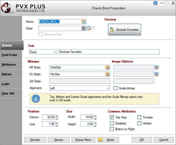
When creating or editing a Check Box control, the Check Box Properties dialogue (pictured below using the Folder Style version of the NOMADS designer) is displayed:
Dynamic Control Properties
PxPlus 2018 introduces the capability to create dynamic control properties for Check Box controls when combined with Data Classes. Dynamic data classes are created by selecting the Dynamic check box in Data Class Definitions maintenance. At run time, dynamic control properties are evaluated and automatically populated with values based on what is defined in the data class.
When a data class is entered for the Check Box control, information from the data class is loaded into the Check Box properties. If the data class is dynamic, the dynamic control properties are automatically set to Dynamic initially and assigned a %NOMADS'class' variable that corresponds to a data class field (i.e. %NOMADS'class'length).
Check Box control properties designated as dynamic can be manually switched to dynamic or non-dynamic. A Check Box control can have a combination of dynamic and non-dynamic control properties only when a data class is entered.
See Dynamic Control Properties for information and examples.
Check Box Properties
This dialogue is divided into the following tabbed panels for viewing and/or changing Check Box properties: Display, Font/Color, Attributes, Values, Logic and User Aid.
Name | Unique name of the Check Box control (NOMADS provides a default). Naming conventions for variables apply. Click the Browse Library button to copy parameters from an existing object (via the Library Browse dialogue). | ||||||||||||||||||||||||||||||||||||||||
Class | Enter a Data Class to load the information from the data class definition into the control's properties. If using Property Sheets, click the Data Class button and enter a data class in the Data Class Options dialogue. (The Data Class Options dialogue was added in PxPlus 2018.) To enter a data class, use any of the following methods:
If the data class is changed, a message will display prior to overwriting any information. This works similar to using the Reapply Data Class button. If the data class assigned to the control is deleted in Data Class Definitions, the text ** Class not on File ** will display (will be a message box if using Property Sheets). (Dynamic data classes and properties were added in PxPlus 2018.) | ||||||||||||||||||||||||||||||||||||||||
(Data Class Maintenance) | Click this button to launch Data Class Definitions for creating or editing a data class. If using Property Sheets, click the Data Class button, then click the Data Class Maintenance button in the Data Class Options dialogue. (The Data Class Options dialogue was added in PxPlus 2018.) | ||||||||||||||||||||||||||||||||||||||||
(Reapply Data Class) | (Available when a data Class is entered) Click this button to update control properties with current information from the selected data class. A message displays before any control properties are overwritten. If using Property Sheets, click the Data Class button and select the Reapply Class check box in the Data Class Options dialogue. (The Data Class Options dialogue was added in PxPlus 2018.) (The Reapply Data Class button was added in PxPlus 2018.) | ||||||||||||||||||||||||||||||||||||||||
Dynamic Class | (Display Only) Indicates whether the selected data Class is Dynamic. See Dynamic Control Properties. If using Property Sheets, click the Data Class button to display the Dynamic Class check box in the Data Class Options dialogue. (The Data Class Options dialogue was added in PxPlus 2018.) | ||||||||||||||||||||||||||||||||||||||||
Preview | Displays how the visible properties of the control will appear at run time. | ||||||||||||||||||||||||||||||||||||||||
Display ( * indicates a Dynamic property) | |||||||||||||||||||||||||||||||||||||||||
*Text | Sets the button text. Click the drop-down arrow for a list of selections: Fixed, Expression, Message Library Reference or Dynamic. (Dynamic is available only when a data Class is entered.) If a dynamic data class is entered, this property will be automatically set to Dynamic and assigned a %NOMADS'class' variable, which is locked. If the data class is not dynamic, this property can be manually set to Dynamic. See Dynamic Control Properties. (Dynamic data classes and properties were added in PxPlus 2018.) | ||||||||||||||||||||||||||||||||||||||||
Bitmaps | Sets the button bitmap. Click the Bitmap Library button to select a bitmap from the Bitmaps dialogue for the state, if applicable.
If a dynamic data class is entered, these properties will be set as dynamic and locked. See Dynamic Control Properties. (Dynamic data classes and properties were added in PxPlus 2018.) | ||||||||||||||||||||||||||||||||||||||||
*Image Options | (Available when Bitmaps for Off/On/3rd States are selected) Sets advanced image options for the bitmap. Click the Additional Image Options button to the right of the Image Options multi-line to invoke the Image Options dialogue. 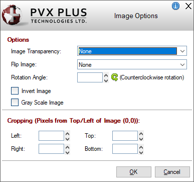 This dialogue consists of the following:
(The Image Options dialogue was added in PxPlus 2019.) | ||||||||||||||||||||||||||||||||||||||||
Position |
(Support for increased Column and Line maximums was added in PxPlus 2021.) | ||||||||||||||||||||||||||||||||||||||||
Size |
(Support for increased Width and Height maximums was added in PxPlus 2021.) | ||||||||||||||||||||||||||||||||||||||||
Common Attributes | Optional attributes for Tab Stop, Disabled, Button on Right, Tri-State and Hidden. See Attributes. | ||||||||||||||||||||||||||||||||||||||||
Font/Color ( * indicates a Dynamic property) | |||||||||||||||||||||||||||||||||||||||||
Font Specification |
| ||||||||||||||||||||||||||||||||||||||||
Color |
(The Color Selections Query button and dialog were added in PxPlus 2020.) | ||||||||||||||||||||||||||||||||||||||||
Attributes | Optional attributes for Bold, Italics, etc. See Attributes. | ||||||||||||||||||||||||||||||||||||||||
Alignment | Sets the text alignment on the button. Selections of Left Justify, Center and Right Justify are available when defining a Check Box with both text and bitmap(s). See Display. When defining a Check Box with text only, this defaults to Center, and the other two selections are not available. | ||||||||||||||||||||||||||||||||||||||||
*Visual Class | Assign a visual class to the control. Can be Fixed, Expression or Dynamic. (Dynamic is available only when a data Class is entered.) Click the Visual Class Maintenance button to launch the Visual Classes Maintenance utility for creating or editing visual classes. To assign visual classes to controls at the library level, see Visual Class Assignment. If a dynamic data class is entered, this property will be automatically set to Dynamic and assigned a %NOMADS'class' variable, which is locked. If the data class is not dynamic, this property can be manually set to Dynamic. See Dynamic Control Properties. (The Dynamic drop box option was added in PxPlus 2018.) | ||||||||||||||||||||||||||||||||||||||||
*iNomads Class | Assign an iNomads class to the control. Can be Fixed, Expression or Dynamic. (Dynamic is available only when a data Class is entered.) If a dynamic data class is entered, this property will be automatically set to Dynamic and assigned a %NOMADS'class' variable, which is locked. If the data class is not dynamic, this property can be manually set to Dynamic. See Dynamic Control Properties. The iNomads class contains class attribute references used when defining the control in the HTML code generated in iNomads. An iNomads class reference must start with an alpha character (A-Z or a-z), followed by any combination of A-Z, a-z, 0-9, underscore or dash. Multiple references may be entered, separated by a space. For a list of pre-defined iNomads classes, see iNomads Classes. (The Dynamic drop box option was added in PxPlus 2018.) | ||||||||||||||||||||||||||||||||||||||||
Attributes ( * indicates a Dynamic property) | |||||||||||||||||||||||||||||||||||||||||
Attributes |
| ||||||||||||||||||||||||||||||||||||||||
*User-Defined Tag Field | For controls, data/tag field that can be used to pass information on such things as formatting, error messages or validation rules. Can be Fixed, Expression or Dynamic. (Dynamic is available only when a data Class is entered.) Field contents are placed in a variable using the control name with a .TAG$ extension. If a dynamic data class is entered, this property will be automatically set to Dynamic and assigned a %NOMADS'class' variable, which is locked. If the data class is not dynamic, this property can be manually set to Dynamic. See Dynamic Control Properties. (The Dynamic drop box option was added in PxPlus 2018.) | ||||||||||||||||||||||||||||||||||||||||
Values ( * indicates a Dynamic property) | |||||||||||||||||||||||||||||||||||||||||
Dynamic (from Data Class) | (Available when a data Class is entered) If selected, identifies the Default Setting and Values properties as dynamic. If a dynamic data class is entered, this check box is automatically selected. If the data class is not dynamic, this check box can be manually selected. (Dynamic data classes and properties were added in PxPlus 2018.) | ||||||||||||||||||||||||||||||||||||||||
Numeric | Returns a value for the control in a numeric variable. If the Dynamic (from Data Class) check box is selected, the Numeric property will be locked. | ||||||||||||||||||||||||||||||||||||||||
*Default Setting | Initial value to be applied when the Check Box is drawn. If the Dynamic (from Data Class) check box is selected, the Default Setting and Values properties will all be set as dynamic and locked (cannot be set individually). See Dynamic Control Properties. (Dynamic data classes and properties were added in PxPlus 2018.) | ||||||||||||||||||||||||||||||||||||||||
*Values |
If the Dynamic (from Data Class) check box is selected, the Default Setting and Values properties will all be set as dynamic and locked (cannot be set individually). See Dynamic Control Properties. (Dynamic data classes and properties were added in PxPlus 2018.) | ||||||||||||||||||||||||||||||||||||||||
Logic | |||||||||||||||||||||||||||||||||||||||||
Default Program | Displays the name of the Default Program used in the Panel Header definition. (The Default Program was added for display in PxPlus 2019.) | ||||||||||||||||||||||||||||||||||||||||
Post Create | Logic to be processed after the control is drawn. Click the drop-down arrow for a list of selections. See Events Logic. Click the Program Logic button beside the Perform or Call action to launch the default program editor, which is typically the *IT - Integrated Toolkit. To make Ed+ the default program editor, change the setting for the %NOMADS'Program_Editor property to Ed+. (The ability to set Ed+ as the default program editor was added in PxPlus 2023.) | ||||||||||||||||||||||||||||||||||||||||
When Receiving Focus | Logic to execute when the control receives focus. Click the drop-down arrow for a list of selections. See Events Logic. Click the Program Logic button beside the Perform or Call action to launch the default program editor, which is typically the *IT - Integrated Toolkit. To make Ed+ the default program editor, change the setting for the %NOMADS'Program_Editor property to Ed+. (The ability to set Ed+ as the default program editor was added in PxPlus 2023.) | ||||||||||||||||||||||||||||||||||||||||
When Button Pressed | Logic to be executed when focus leaves the control or the state of the control has changed. Click the drop-down arrow for a list of selections. See Events Logic. Click the Program Logic button beside the Perform or Call action to launch the default program editor, which is typically the *IT - Integrated Toolkit. To make Ed+ the default program editor, change the setting for the %NOMADS'Program_Editor property to Ed+. (The ability to set Ed+ as the default program editor was added in PxPlus 2023.) | ||||||||||||||||||||||||||||||||||||||||
User Aid ( * indicates a Dynamic property) | |||||||||||||||||||||||||||||||||||||||||
Dynamic (from Data Class) | (Available when a data Class is entered) If selected, identifies which Help Reference properties are dynamic. If a dynamic data class is entered, this check box is automatically selected. If the data class is not dynamic, this check box can be manually selected. (Dynamic data classes and properties were added in PxPlus 2018.) | ||||||||||||||||||||||||||||||||||||||||
*Help Reference | Help text to be invoked at run time by pressing Shift - F1 while focus is on a control.
If the Dynamic (from Data Class) check box is selected, the Help Reference properties will be dynamic and locked. See Dynamic Control Properties. (Dynamic data classes and properties were added in PxPlus 2018.) | ||||||||||||||||||||||||||||||||||||||||
*Floating Tip | Mouse pointer message for the control. Can be a Fixed value, string Expression, Message Library Reference or Dynamic. (Dynamic is available only when a data Class is entered.) If a dynamic data class is entered, this property will be automatically set to Dynamic and assigned a %NOMADS'class' variable, which is locked. If the data class is not dynamic, this property can be manually set to Dynamic. See Dynamic Control Properties. You can customize the floating tip by adding a tip title, descriptive tip text and a hyperlink. These features enhance the visual display and functionality of the tip by providing users with much needed information at their fingertips. You can define either a Standard tip or an HTML tip that provides a simplified HTML Editor for customizing the tip text. To do this, click the button to the right of the Floating Tip multi-line input to invoke the Define Info Tip dialogue. See Defining an Info Tip. NOMADS Wiki Help The floating tip text can be used when displaying the Wiki Help. Info tips, however, are not supported and will be ignored. (Support for customizing Floating Tips was added in PxPlus 2016.) | ||||||||||||||||||||||||||||||||||||||||
*Message Bar | Text to be displayed in the panel's status bar when focus is on the control. Can be a Fixed value, string Expression, Message Library Reference or Dynamic. (Dynamic is available only when a data Class is entered.) If a dynamic data class is entered, this property will be automatically set to Dynamic and assigned a %NOMADS'class' variable, which is locked. If the data class is not dynamic, this property can be manually set to Dynamic. See Dynamic Control Properties. (Dynamic data classes and properties were added in PxPlus 2018.) | ||||||||||||||||||||||||||||||||||||||||
Security | Security restrictions. See Restricting Access for information on Object Security Definition. | ||||||||||||||||||||||||||||||||||||||||
Groups | Assign the control to a group. See Group Assignment. | ||||||||||||||||||||||||||||||||||||||||
Popup Menu | Associate a popup menu that will appear when you right-click the mouse over the selected control. See Popup Menu. | ||||||||||||||||||||||||||||||||||||||||
Notes | Add notes/comments for the control. Maximum 1024 characters. These notes also display in the Wiki Help documentation for the panel. See NOMADS Wiki Help. (The Notes button was added in PxPlus 2023.) | ||||||||||||||||||||||||||||||||||||||||


See Also
CHECK_BOX Properties
CHECK_BOX Directive
TRISTATE_BOX Directive