The Shapes tool is used to draw basic graphics, such as Arc, Circle, Line, Pie, Polygon and Rectangle, directly on a panel; e.g. a Pie shape may be used to provide a visual illustration for sales figures. Pen Style and Fill options are also available (where applicable) to enhance the visual display of the shape.
To insert images created outside of NOMADS and PxPlus, use the Image tool. For more advanced chart styles, use the Chart tool. A shape object is for display purposes only and does not respond to events.
To view a video presentation on how to use a Rectangle shape to add an informational message to a panel, go to How to Add an Info Message.
While the Shapes tool provides a method for creating simple shapes in NOMADS, it is not a freehand drawing tool. Shape characteristics are set primarily by adjusting the object's display properties rather than by dragging the mouse pointer.
To draw a shape object on a panel, select the Shapes control tool from the Controls Toolbar. Hold down the left mouse button and drag the mouse to create a small rectangle as a starting point. Release the mouse button to set the initial coordinates for the new object.
By default, all shape objects start out as a Rectangle but can be easily redefined as an Arc, Circle, Line, Pie or Polygon object by changing the Shape property, and then setting the dimensions and other characteristics by using the Shape Properties.
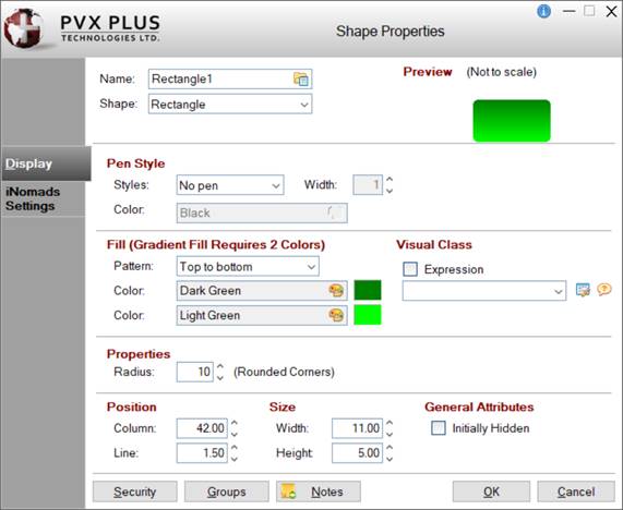
When creating or editing a Shape control, the Shape Properties dialogue (pictured below using the Folder Style version of the NOMADS Panel Designer) is displayed:
This dialogue is divided into the following tabbed panels for viewing and/or changing shape properties: Display and iNomads Settings.
Name
Unique name of the shape control (NOMADS provides a default). Naming conventions for variables apply. Click the Browse Library button to copy parameters from an existing object (via the Library Browse dialogue).
Shape
Click the drop-down arrow for a list of shape types: Arc, Circle, Line, Pie, Poly Line, Polygon, Radius Arc, Radius Circle, Radius Pie and Rectangle. See Important Note above.
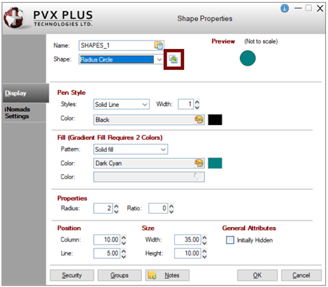
(Convert to new Shape format)
(Available when an existing Radius Arc, Radius Circle, Radius Pie or Poly Line Shape is selected)
Button used to convert a pre-existing shape control (created with the former format) to its newer, redesigned format. Prior to conversion, a message will display, asking to confirm the request.
(The Convert to new Shape format button was added in PxPlus 2019.)
Preview
Displays how the visible properties of the control will appear at run time.
Display
Pen Style
Styles
Click the drop-down arrow for a list of pen styles. The styles Dashed, Dotted, Dash-dot and Dash-dot-dot work only when the Pen Width is 1.
Width
Pen width in graphical units. Valid entries are 0 - 255.
Color
Click the Query button to access Color Selections. Valid formats for color selections include predefined system colors (e.g. Light Red), Custom (RGB codes), HTML Hex Color Codes, User Defined colors (e.g. Color17) and string Expressions.
(The Color Selections Query button and dialog were added in PxPlus 2020.)
Fill (Gradient Fill Requires 2 Colors)
(Not Applicable for Arc, Radius Arc, Line and Poly Line Shapes)
Pattern
Click the drop-down arrow to select the direction of the gradient fill or pattern.
Color (1st)
Starting color for the shape. Click the Query button to access Color Selections. Valid formats for color selections include predefined system colors (e.g. Light Red), Custom (RGB codes), HTML Hex Color Codes, User Defined colors (e.g. Color17) and string Expressions.
Color (2nd)
Second color for the two-color gradient or fill pattern. Fill colors are enabled based on the Fill Pattern selected. Click the Query button to access Color Selections. Valid formats for color selections include predefined system colors (e.g. Light Red), Custom (RGB codes), HTML Hex Color Codes, User Defined colors (e.g. Color17) and string Expressions.
(The Color Selections Query button and dialog were added in PxPlus 2020.)
Visual Class
(Applicable Only for Circle, Line and Rectangle Shapes)
Assign a visual class to the control.
Click the Visual Class Maintenance button to launch the Visual Classes Maintenance utility for creating or editing visual classes.
Starting column for top left corner of the control - numeric expression. Format mask is #0.00. Valid entries are 0 to 620.
Line
Starting line for top left corner of the control - numeric expression. Format mask is #0.00. Valid entries are 0 to 255.
(Support for increased Column and Line maximums was added in PxPlus 2021.)
Size
Width
Width of control in number of columns - numeric expression. Format mask is #0.00. Valid entries are 0 to 620.
Height
Height of control in number of lines - numeric expression. Format mask is #0.00. Valid entries are 0 to 255.
(Support for increased Width and Height maximums was added in PxPlus 2021.)
General Attributes
Initially Hidden
Control is not displayed but is accessible programmatically.
iNomads Settings
iNomads Class
Assign an iNomads class to the control. Can be Fixed or Expression.
The iNomads class contains class attribute references used when defining the control in the HTML code generated in iNomads. An iNomads class reference must start with an alpha character (A-Z or a-z), followed by any combination of A-Z, a-z, 0-9, underscore or dash. Multiple references may be entered, separated by a space.
For a list of pre-defined iNomads classes, see iNomads Classes.
(The iNomads Class property was added to Shapes in PxPlus 2018.)
Security
Security restrictions. See Restricting Access for information on Object Security Definition.
Add notes/comments for the control. Maximum 1024 characters.
(The Notes button was added in PxPlus 2023.)
Rectangle Object
The Display properties below apply specifically to a Rectangle object.
Display
Fill (Gradient Fill Requires 2 Colors)
Pattern
Click the drop-down arrow to select the direction of the gradient fill or pattern.
Color (1st)
Starting color for the shape. Click the Query button to access Color Selections. Valid formats for color selections include predefined system colors (e.g. Light Red), Custom (RGB codes), HTML Hex Color Codes, User Defined colors (e.g. Color17) and string Expressions.
Color (2nd)
Second color for the two-color gradient or fill pattern. Fill colors are enabled based on the Fill Pattern selected. Click the Query button to access Color Selections. Valid formats for color selections include predefined system colors (e.g. Light Red), Custom (RGB codes), HTML Hex Color Codes, User Defined colors (e.g. Color17) and string Expressions.
(The Color Selections Query button and dialog were added in PxPlus 2020.)
Properties
Radius
Radius value in graphical units. Valid entries are 0 - 255. Applying a Radius value greater than zero produces a rectangle with rounded corners.
Example:
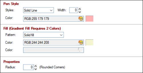
The properties shown below produce the Rectangle shape used in creating the following PxPlus Info message for the Library Bulk Edit and Search utility:
Given …
Yields …
To view a video presentation on how to use a Rectangle shape to add an informational message to a panel, go to How to Add an Info Message.
Arc Object
The Display properties below apply specifically to an Arc object.
Display
Properties
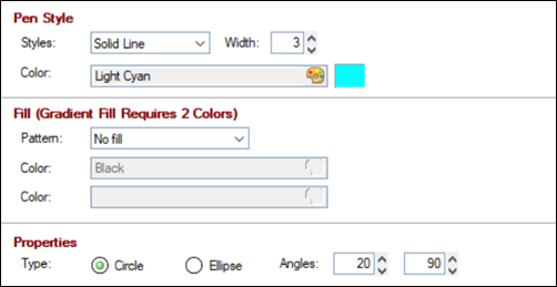
Type
Select the Arc portion of a Circle shape or an Ellipse shape.
Angles
Angles (in degrees) measured counter clockwise from the right-center (3 o'clock) position of the arc circle to the starting and ending points of the arc. Valid entries are 0 - 360.
(The Type property was added in PxPlus 2019.)
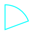
Example:
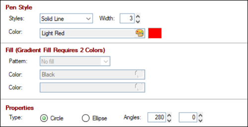
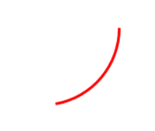
The properties shown below produce the following Arc shape:
Given …
Yields …
Circle Object
The Display properties below apply specifically to a Circle object.
Display
Fill (Gradient Fill Requires 2 Colors)
Pattern
Click the drop-down arrow to select the direction of the gradient fill or pattern.
Color (1st)
Starting color for the shape. Click the Query button to access Color Selections. Valid formats for color selections include predefined system colors (e.g. Light Red), Custom (RGB codes), HTML Hex Color Codes, User Defined colors (e.g. Color17) and string Expressions.
Color (2nd)
Second color for the two-color gradient or fill pattern. Fill colors are enabled based on the Fill Pattern selected. Click the Query button to access Color Selections. Valid formats for color selections include predefined system colors (e.g. Light Red), Custom (RGB codes), HTML Hex Color Codes, User Defined colors (e.g. Color17) and string Expressions.
(The Color Selections Query button and dialog were added in PxPlus 2020.)
Properties
Type
Select a Circle or an Ellipse shape.
(The Type property was added in PxPlus 2019.)
Example:
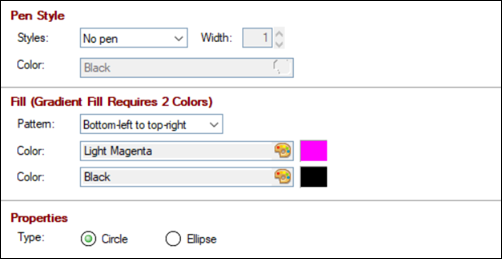
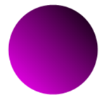
The properties shown below produce the following Circle shape:
Given …
Yields …
Line Object
The Display properties below apply specifically to a Line object.
Display
Properties
Line Type
Line selections are:
Horizontal
Horizontal line.
Vertical
Vertical line.
Down
Line moves down toward the right.
Up
Line moves up toward the right.
The length and angle of the line is determined by the height and width of the shape object. If a line with multiple segments is required, use the Poly Line object.
(The Line Type property was added in PxPlus 2019.)
Example:
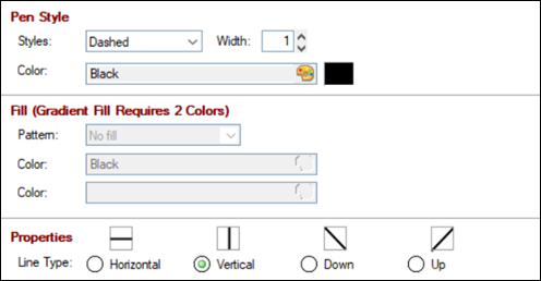
The properties shown below produce the following Line shape:
Given …
Yields …
Pie Object
The Display properties below apply specifically to a Pie object.
Display
Fill (Gradient Fill Requires 2 Colors)
Pattern
Click the drop-down arrow to select the direction of the gradient fill or pattern.
Color (1st)
Starting color for the shape. Click the Query button to access Color Selections. Valid formats for color selections include predefined system colors (e.g. Light Red), Custom (RGB codes), HTML Hex Color Codes, User Defined colors (e.g. Color17) and string Expressions.
Color (2nd)
Second color for the two-color gradient or fill pattern. Fill colors are enabled based on the Fill Pattern selected. Click the Query button to access Color Selections. Valid formats for color selections include predefined system colors (e.g. Light Red), Custom (RGB codes), HTML Hex Color Codes, User Defined colors (e.g. Color17) and string Expressions.
(The Color Selections Query button and dialog were added in PxPlus 2020.)
Properties
Type
Select the Pie portion of a Circle shape or an Ellipse shape.
Angles
Angles (in degrees) measured counter clockwise from the right-center (3 o'clock) position of the pie circle to the starting and ending points of the pie slice. Valid entries are 0 - 360.
(The Type property was added in PxPlus 2019.)
Example:
The properties shown below produce the following Pie shape:
Given …
Yields …
Poly Line Object
As of PxPlus 2019, the former Line object was renamed to Poly Line and continues to function as it did previously. The recommendation is to use the redesigned Line object.
The Display properties below apply specifically to a Poly Line object.
Display
Properties
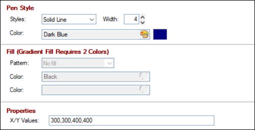
X/Y Values
Logical screen coordinates in graphical units for the ending point of the line (starting point is established via the Position and Size properties). Graphical units are similar to pixels, not line/column values. If the line has multiple segments, multiple X/Y values, separated by a comma, may be entered.
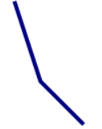
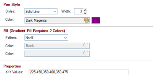
Example:
The properties shown below produce the following Poly Line shape:
Given …
Yields …
Polygon Object
The Display properties below apply specifically to a Polygon object.
Display
Fill (Gradient Fill Requires 2 Colors)
Pattern
Click the drop-down arrow to select the direction of the gradient fill or pattern.
Color (1st)
Starting color for the shape. Click the Query button to access Color Selections. Valid formats for color selections include predefined system colors (e.g. Light Red), Custom (RGB codes), HTML Hex Color Codes, User Defined colors (e.g. Color17) and string Expressions.
Color (2nd)
Second color for the two-color gradient or fill pattern. Fill colors are enabled based on the Fill Pattern selected. Click the Query button to access Color Selections. Valid formats for color selections include predefined system colors (e.g. Light Red), Custom (RGB codes), HTML Hex Color Codes, User Defined colors (e.g. Color17) and string Expressions.
(The Color Selections Query button and dialog were added in PxPlus 2020.)
Properties
X/Y Values
Logical screen coordinates in graphical units for each of the polygon's corners. Graphical units are similar to pixels, not line/column values.
Example:
The properties shown below produce the following Polygon shape:
Given …
Yields …
Radius Arc Object
As of PxPlus 2019, the former Arc object was renamed to Radius Arc and continues to function as it did previously. The recommendation is to use the redesigned Arc object.
The Display properties below apply specifically to a Radius Arc object.
Display
Properties
Radius
Radius value in graphical units. Valid entries are 0 - 255.
Ratio
Numeric aspect ratio/viewpoint. Valid entries are 0 - 255.
Angles
Angles (in degrees) measured counter clockwise from the right-center (3 o'clock) position of the arc circle to the starting and ending points of the arc. Valid entries are 0 - 360.
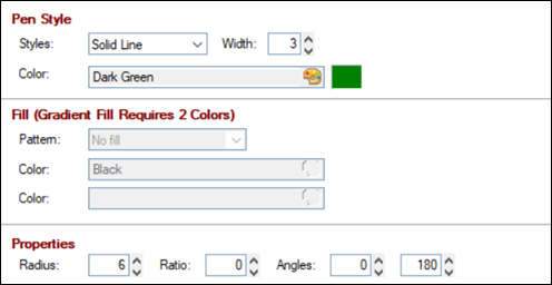
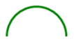
Example:
The properties shown below produce the following Radius Arc shape:
Given …
Yields …
Radius Circle Object
As of PxPlus 2019, the former Circle object was renamed to Radius Circle and continues to function as it did previously. The recommendation is to use the redesigned Circle object.
The Display properties below apply specifically to a Radius Circle object.
Display
Fill (Gradient Fill Requires 2 Colors)
Pattern
Click the drop-down arrow to select the direction of the gradient fill or pattern.
Color (1st)
Starting color for the shape. Click the Query button to access Color Selections. Valid formats for color selections include predefined system colors (e.g. Light Red), Custom (RGB codes), HTML Hex Color Codes, User Defined colors (e.g. Color17) and string Expressions.
Color (2nd)
Second color for the two-color gradient or fill pattern. Fill colors are enabled based on the Fill Pattern selected. Click the Query button to access Color Selections. Valid formats for color selections include predefined system colors (e.g. Light Red), Custom (RGB codes), HTML Hex Color Codes, User Defined colors (e.g. Color17) and string Expressions.
(The Color Selections Query button and dialog were added in PxPlus 2020.)
Properties
Radius
Radius value in graphical units. Valid entries are 0 - 255.
Ratio
Numeric aspect ratio/viewpoint. Valid entries are 0 - 255.
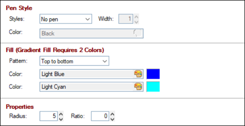
Example:
The properties shown below produce the following Radius Circle shape:
Given …
Yields …
Radius Pie Object
As of PxPlus 2019, the former Pie object was renamed to Radius Pie and continues to function as it did previously. The recommendation is to use the redesigned Pie object.
The Display properties below apply specifically to a Radius Pie object.
Display
Fill (Gradient Fill Requires 2 Colors)
Pattern
Click the drop-down arrow to select the direction of the gradient fill or pattern.
Color (1st)
Starting color for the shape. Click the Query button to access Color Selections. Valid formats for color selections include predefined system colors (e.g. Light Red), Custom (RGB codes), HTML Hex Color Codes, User Defined colors (e.g. Color17) and string Expressions.
Color (2nd)
Second color for the two-color gradient or fill pattern. Fill colors are enabled based on the Fill Pattern selected. Click the Query button to access Color Selections. Valid formats for color selections include predefined system colors (e.g. Light Red), Custom (RGB codes), HTML Hex Color Codes, User Defined colors (e.g. Color17) and string Expressions.
(The Color Selections Query button and dialog were added in PxPlus 2020.)
Properties
Radius
Radius value in graphical units. Valid entries are 0 - 255.
Ratio
Numeric aspect ratio/viewpoint. Valid entries are 0 - 255.
Angles
Angles (in degrees) measured counter clockwise from the right-center (3 o'clock) position of the pie circle to the starting and ending points of the pie slice. Valid entries are 0 - 360.
Example:
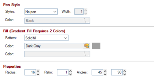
The properties shown below produce the following Radius Pie shape: