Template Maintenance is used to view and modify the settings for a previously created template. A template defines the layout of a panel and how it will be presented to the Web browser. It controls the visual characteristics of the Web page such as size, font, colors and images.
When a new template is created and saved using the Template Designer Wizard, a directory is created for that template in the lib\_plus\inomads\templates directory. Depending on the settings used to create the template, the template directory can contain any or all of the following files:
File
Contents Description
template.conf
Template configuration settings
.tpl files
HTML segments
style.css file
Style sheet information used by the browser to define the presentation of the panel (i.e. font, color and background)
sysimage directory
Replacement system images (!xxx)
custom.conf and custom.ini
Custom settings
Template Maintenance is invoked by using any of the following methods:
Expand the Web Deployment category and select iNomads Setup to invoke the iNomads Setup window.
From the Template drop box, select a template with custom settings previously defined (i.e. the template-specific directory contains the custom.ini file). Then, click the Custom button located below the Options button.
From the Template drop box, select a template with custom settings previously defined (i.e. the template-specific directory contains the custom.ini file). Then, click the Custom button located below the Options button.
From the PxPlus Command prompt
Invoke the iNomads Setup window by entering the following command:
RUN "*plus/inomads/admin"
From the Template drop box, select a template with custom settings previously defined (i.e. the template-specific directory contains the custom.ini file). Then, click the Custom button located below the Options button.
Template Maintenance is launched for the selected template, allowing you to view and modify any of the settings as needed.
This window consists of the following:
Template
Name of the selected template. The name is for viewing only.
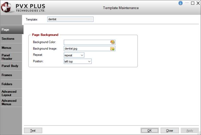
Page
Page Background
Settings for defining the page background color or image.
Background Color
Specify the color to use for the background. See Color Specification for information on applying a color. When a color is selected/entered, a preview of that color is displayed.
Background Image
Select the image to display for the background. Click the Image browse button to select an image. If the image selected is not located under the *plus/inomads directory, you are asked if you want to copy the image file to an Images directory that will be created for that template under *plus\inomads\templates. It is a good idea to keep a copy of the image file in the template's directory so that it can be easily located and displayed when the template is applied.
Repeat
(Available only when an Image has been selected)
Displays the following selections for duplicating the image:
repeat
Duplicates the image (Default)
no-repeat
Does not duplicate the image
repeat-x
Duplicates the image horizontally in conjunction with the selected Position
repeat-y
Duplicates the image vertically in conjunction with the selected Position
Position
(Available only when an Image has been selected)
Displays the following selections for positioning the image: left top (Default), left center, left bottom, right top, right center, right bottom, center top, center center, center bottom, full screen.
Sections
Click or select the section you wish to edit
Displays a diagram of the layout that was selected when the template was initially created. To view or modify the settings for a particular section, click on that section inside the diagram or use the adjacent Section spinner control. By default, the first section is highlighted.
You can also add new sections to the template layout using the grid on the Advanced Layout tab. See Advanced Layout.
Section
Indicates the number of the template section currently highlighted. To change to a different section, use the up/down arrows attached to this field or manually enter the number. You can also click on the desired section inside the diagram shown on the left.
Background/Size
Color
Specify the color to use for the section background. See Color Specification for information on applying a color. When a color is selected/entered, a preview of that color is displayed.
Image
Select the image to display for the section background. Click the Image browse button to select an image. If the image selected is not located under the *plus/inomads directory, you are asked if you want to copy the image file to an Images directory that will be created for that template under *plus\inomads\templates. It is a good idea to keep a copy of the image file in the template's directory so that it can be easily located and displayed when the template is applied.
Image Repeat
(Available only when a Background Image has been selected)
Selections for duplicating the image are:
repeat
Duplicates the image (Default)
no-repeat
Does not duplicate the image
repeat-x
Duplicates the image horizontally in conjunction with the selected Position
repeat-y
Duplicates the image vertically in conjunction with the selected Position
Position
(Available only when a Background Image has been selected)
Selections for positioning the image are: left top (Default), left center, left bottom, right top, right center, right bottom, center top, center center, center bottom, full screen.
Width/Height
Enter a Width/Height for the section (in pixels). If the width/height of the section increases as the panel is resized, leave the Width/Height blank.
Fixed Attributes (Use Advanced Layout to Change)
The settings in this section are view only. To modify them, select the Advanced Layout tab (see details below).
Columns Wide
Width of the section, which is measured by the number of columns over which it extends horizontally.
Rows High
Height of the section, which is measured by the number or rows over which it extends vertically.
Last Column on Row
Check box that indicates whether the section is in the last column at the end of the current row.
Last Row in Table
Check box that indicates whether the section is in the last row of the table.
Includes Panel
Check box that indicates whether the section contains a panel.
Section Contents
You can optionally include additional contents such as Text, Images, Menus and Other parameters in the currently selected section. See Section Contents.
Menus
Menu Name
Enter a name for the new menu definition. To view or modify the settings for a previously saved menu definition, select the name from the drop box or manually enter the name.
You can also create multiple menu definitions for the same template. To do this, highlight the existing menu name and type a new name. If the new menu name does not exist, a message asks if you wish to reset the current menu values and offers three possible responses: Yes, No, Contents Only:
Yes
All options are reset back to their default values to allow new settings to be entered for the new menu definition.
No
All previous settings, including menu contents, are retained and reused for the new menu definition. Edit the settings and menu contents as needed.
Contents Only
(Default) All previous settings, except menu contents, are retained and reused for the new menu definition. Edit the settings and enter new menu contents as needed.
Save the new menu definition either by clicking OK (closes Template Maintenance) or by clicking Apply (leaves Template Maintenance open with the current record displayed).
Menu Generation Program
Name of the program file to use for generating the menu. Click the Program browse button to specify the program file or enter the program pathname. See Menu Generation Program.
(Added in PxPlus 2016)
Layout
Type
Indicates whether the menu layout is vertical or horizontal:
vertical
Positions the menu options one above the other (Default)
horizontal
Positions the menu options one beside the other on the same line
Wide
Width of the menu options area (in pixels). This setting is ignored when horizontal is selected for the Type.
High
Height of the menu (in pixels).
Border
Color
Menu border color. See Color Specification for information on applying a color.
Corner Radius
(Available only when a Border Color has been specified)
Enter a value for the rounded corner radius or use the spinner controls to specify a value. A blank or low value (i.e. <10) produces squared menu corners. A higher value (10 - 30) produces progressively rounded menu corners. Maximum value is 99.
Shadow
Shadow style for the menu. Selections are none (Default), bottom right, bottom left, top right, top left, full, bottom, top, left, right.
Contents
Font
Font for the menu text.
Size
Font size for the menu text (in pixels).
Line Color
Color for the line (vertical or horizontal) separating the menu options. See Color Specification for information on applying a color.
Normal Display
Background Color
Specify a color for the menu background. See Color Specification for information on applying a color.
Text Color
Specify a color for the menu text. See Color Specification for information on applying a color.
Bold
Select this check box to bold the menu text.
Underscore
Select this check box to underline the menu text.
Mouse Over Display
Background Color
Specify a color for the background only when the mouse pointer is positioned over individual menu options. See Color Specification for information on applying a color.
Text Color
Specify a color for the menu text only when the mouse pointer is positioned over individual menu options. See Color Specification for information on applying a color.
Bold
Select this check box to bold the menu text only when the mouse pointer is positioned over individual menu options.
Underscore
Select this check box to underline the menu text only when the mouse pointer is positioned over individual menu options.
Background Image
Image
Select the image to display for the menu background. Click the Image browse button to select an image. If the image selected is not located under the *plus/inomads directory, you are asked if you want to copy the image file to an Images directory that will be created for that template under *plus\inomads\templates. It is a good idea to keep a copy of the image file in the template's directory so that it can be easily located and displayed when the template is applied.
Mouse Over Image
Select the image to display when the mouse pointer is positioned over the menu. Click the Image browse button to select an image. If the image selected is not located under the *plus/inomads directory, you are asked if you want to copy the image file to an Images directory that will be created for that template under *plus\inomads\templates. It is a good idea to keep a copy of the image file in the template's directory so that it can be easily located and displayed when the template is applied.
Repeat
(Available only when an image has been selected for the menu background Image (see above))
Selections for duplicating the image are:
repeat
Duplicates the image (Default)
no-repeat
Does not duplicate the image
repeat-x
Duplicates the image horizontally in conjunction with the selected Position
repeat-y
Duplicates the image vertically in conjunction with the selected Position
Position
(Available only when an image has been selected for the menu background Image (see above))
Selections for positioning the image are: left top (Default), left center, left bottom, right top, right center, right bottom, center top, center center, center bottom, full screen.
Menu Content
This section is used to define the contents for the menu. If a Menu Generation Program is entered, the Menu Contents grid is not available for entry.
For each option that you want to include in the menu, a separate grid row must be entered with the following details:
Menu text
Enter the text for the menu option that will be visible to the user.
Transaction or URL
If the menu launches a different iNomads transaction, enter the Transaction code. If the menu spawns a sub-menu, enter the sub-menu name in the format menu:name (wherename is the sub-menu name). If the menu launches a Web page, enter the URL address preceded with http://.
Use the Delete and Move Up/Move Down buttons beside the list box to remove a menu option or rearrange the order of the options within the menu.
To view or change the content for a different menu, select a menu from the Menu Name drop box. Selecting a different menu (or a different folder tab) automatically saves any changes to the current menu definition. You can also click the Apply button to save changes.
Panel Header
Panel Header
Background Color
Specify a color for the panel header background. See Color Specification for information on applying a color.
Background Image
Select the image to display for the panel header background. Click the Image browse button to select an image. If the image selected is not located under the *plus/inomads directory, you are asked if you want to copy the image file to an Images directory that will be created for that template under *plus\inomads\templates. It is a good idea to keep a copy of the image file in the template's directory so that it can be easily located and displayed when the template is applied.
Suppress Header Text
Select this check box to hide the panel header text. When selected, the other panel header text options, Text Color, Text Font and Font Size, are disabled.
Text Color
(Available if the Suppress Header Text check box is not selected)
Specify a color for the panel header text. See Color Specification for information on applying a color.
Text Font
(Available if the Suppress Header Text check box is not selected)
Enter a font for the panel header text.
Font Size
(Available if the Suppress Header Text check box is not selected)
Enter a font size for the panel header text.
Panel Border
Color
Specify a color for the panel border. See Color Specification for information on applying a color.
Style
Select a style for the panel border. Selections are standard (default), none, solid, dotted, dashed, double, groove, ridge, inset, outset.
Width
Enter the width for the panel border (in pixels).
Corner Radius
Enter a value for the rounded corner radius. A blank or low value (i.e. <10) produces squared panel corners. A higher value (10 - 30) produces progressively rounded panel corners. Maximum value is 99.
Shadow
Select this check box to create a shadow effect behind the panel.
Panel Body
Panel Background
Background Color
Specify a color for the panel header background. See Color Specification for information on applying a color.
Background Image
Select the image to display for the panel background. Click the Image browse button to select an image. If the image selected is not located under the *plus/inomads directory, you are asked if you want to copy the image file to an Images directory that will be created for that template under *plus\inomads\templates. It is a good idea to keep a copy of the image file in the template's directory so that it can be easily located and displayed when the template is applied.
Repeat
(Available only when a Background Image has been selected for the panel background)
Selections for duplicating the image are:
repeat
Duplicates the image (Default)
no-repeat
Does not duplicate the image
repeat-x
Duplicates the image horizontally in conjunction with the selected Position
repeat-y
Duplicates the image vertically in conjunction with the selected Position
Position
(Available only when a Background Image has been selected for the panel background)
Selections for positioning the image are: left top (Default), left center, left bottom, right top, right center, right bottom, center top, center center, center bottom, full screen.
Panel Text
Text Color
Specify a color for the panel text. See Color Specification for information on applying a color.
Text Font
Enter a font for the panel text.
Font Size
Enter a font size for the panel text.
Frames
Frame Header and Body
Header Background Color
Specify a color for the frame header background. See Color Specification for information on applying a color.
Header Background Image
Select the image to display for the frame header background. Click the Image browse button to select an image. If the image selected is not located under the *plus/inomads directory, you are asked if you want to copy the image file to an Images directory that will be created for that template under *plus\inomads\templates. It is a good idea to keep a copy of the image file in the template's directory so that it can be easily located and displayed when the template is applied.
Body Background Color
Specify a color for the frame background. See Color Specification for information on applying a color.
Frame Border
Color
Specify a color for the frame border. See Color Specification for information on applying a color.
Style
Select a style for the frame border. Selections are rounded (default), square, none.
Frame Text
Text Color
Specify a color for the frame header text. See Color Specification for information on applying a color.
Text Font
Enter a font for the frame header text.
Text Size
Enter a font size for the frame header text.
Folders
Folder Background
Background Color
Specify a color for the folder background (excluding the tabs). See Color Specification for information on applying a color. If no folder Background Color is defined, the folder background will be the color defined for the Active Tab Background.
Folder Border
Color
Specify a color for the folder border. See Color Specification for information on applying a color.
Style
Select a border style to apply around the folder and the tabs. Selections are standard (Default), none, solid.
Folder Tab Colors
Active Tab Background
Specify a color for the background of the active tab. See Color Specification for information on applying a color.
Active Tab Text
Specify a color for the text of the active tab. See Color Specification for information on applying a color.
Inactive Tab Background
Specify a color for the background of the inactive tab. See Color Specification for information on applying a color.
Inactive Tab Text
Specify a color for the text of the inactive tab. See Color Specification for information on applying a color.
Disabled Tab Background
Specify a color for the background of the disabled tab. See Color Specification for information on applying a color.
Advanced Layout
Define layout for each section and optional fixed contents
Displays a grid with the settings that were entered for each section of the layout when the template was created. Each grid row represents a numbered section (identified by the SectID column). Each grid column heading represents the name of an option, similar to those on the Sections tab.
Use this grid to refine and adjust the appearance of the template. This is done by modifying the settings for the numbered section(s) you want to adjust and then clicking the Apply button. To add a new section, enter the applicable settings in a blank grid row and then click the Apply button. You can use the Move Up/Move Down buttons to the right of the grid to rearrange the order of the sections. However, keep in mind that other sections of the template layout may be impacted, and the settings for those sections may need to be adjusted.
To view the template with these changes on a Web browser, click the Test button.
Number that identifies each section of the template layout.
Cols
Width of the section, which is measured by the number of columns over which it extends horizontally.
Rows
Height of the section, which is measured by the number or rows over which it extends vertically.
Panel
Check box that indicates whether the section contains a panel.
EndRow
Check box that indicates whether the section is in the last column at the end of the current row.
EndTbl
Check box that indicates whether the section is in the last row of the table.
Wide
Width of the section (in pixels). To change the width of a section, click on this cell for the SectID row that you want to change, enter the new value and click the Apply button. The new value is automatically reflected in the Sections tab.
Hi
Height of the section (in pixels). To change the height of a section, click on this cell for the SectID row that you want to change, enter the new value and click the Apply button. The new value is automatically reflected in the Sections tab.
BackColor
Background color for the section. See Color Specification for information on applying a color.
BackImage
Background image for the section. Click the Image browse button inside this cell to select an image. If the image selected is not located under the *plus/inomads directory, you are asked if you want to copy the image file to an Images directory that will be created for that template under *plus\inomads\templates. It is a good idea to keep a copy of the image file in the template's directory so that it can be easily located and displayed when the template is applied.
Repeat
(Available only when a BackImage has been selected)
Selections for duplicating the image are:
repeat
Duplicates the image (Default)
no-repeat
Does not duplicate the image
repeat-x
Duplicates the image horizontally in conjunction with the selected Position
repeat-y
Duplicates the image vertically in conjunction with the selected Position
Position
(Available only when a BackImage has been selected)
Selections for positioning the image are: left top (Default), left center, left bottom, right top, right center, right bottom, center top, center center, center bottom, full screen.
Section Contents
Displays any additional contents such as Text, Images, Menus and Other parameters that were included in the selected section of the template layout. See Section Contents.
Advanced Menus
Define layout and options for system generated menus
The first grid displays the settings for each menu defined for the selected section. If more than one menu has been defined for the same section, all of menu names will be listed. Each row represents a different menu definition, and each column heading represents the name of an option, similar to those on the Menus tab. The second grid displays the menu contents for the menu definition selected in the first grid.
After a template has been created, you can access the Advanced Menus tab to refine and adjust the menu definition by changing the desired settings and then clicking the Apply button. To view the template with these changes on a Web browser, click the Test button.
Enter a name for the new menu definition or select an existing menu name from the drop box.
Type
Select either a vertical or horizontal menu layout:
vertical
Positions the menu options one above the other (Default)
horizontal
Positions the menu options one beside the other on the same line
Text font
Enter a font for the menu text.
Font Sz
Enter a font size for the menu text (in pixels).
Text Color
Color for the menu text. See Color Specification for information on applying a color.
Bold
Select this check box to bold the menu text.
U/L
Select this check box to underline the menu text.
Width
Enter a width for the menu options area. This setting is ignored when horizontal is selected for the menu layout Type.
Height
Enter a height for the menu options area. (Applies to either horizontal or vertical menu layout Type.)
Shadow
Select a shadow style for the menu. Selections are none (default), bottom right, bottom left, top right, top left, full, bottom, top, left, right.
Border Clr
Color for the menu border. See Color Specification for information on applying a color.
Corner Rad
(Available only when a Border Color has been specified)
Enter a value for the rounded corner radius or use the spinner controls to specify a value. A blank or low value (i.e. <10) produces squared menu corners. A higher value (10 - 30) produces progressively rounded menu corners. Maximum value is 99.
Sep Color
Color for the line (vertical or horizontal) separating the menu options. See Color Specification for information on applying a color.
Back Clr
Color for the menu background. See Color Specification for information on applying a color.
Back Image
Image to display for the menu background. Click the Image browse button to select an image. If the image selected is not located under the *plus/inomads directory, you are asked if you want to copy the image file to an Images directory that will be created for that template under *plus\inomads\templates. It is a good idea to keep a copy of the image file in the template's directory so that it can be easily located and displayed when the template is applied.
Repeat
(Available only when an image has been selected for the menu background Image (see above))
Selections for duplicating the image are:
repeat
Duplicates the image (Default)
no-repeat
Does not duplicate the image
repeat-x
Duplicates the image horizontally in conjunction with the selected Position
repeat-y
Duplicates the image vertically in conjunction with the selected Position
Position
(Available only when an image has been selected for the menu background Image (see above))
Selections for positioning the image are: left top (Default), left center, left bottom, right top, right center, right bottom, center top, center center, center bottom, full screen.
Menu Generation Program
Pathname of the program file to use for generating the menu. See Menu Generation Program. (added in PxPlus 2016)
*Bold
Select this check box to bold the menu text only when the mouse pointer is positioned over individual menu options.
*U/L
Select this check box to underline the menu text only when the mouse pointer is positioned over individual menu options.
*Text Color
Color for the menu text only when the mouse pointer is positioned over individual menu options. See Color Specification for information on applying a color.
*Back Clr
Color for the background only when the mouse pointer is positioned over individual menu options. See Color Specification for information on applying a color.
*Back Image
Image to display when the mouse pointer is positioned over the menu. Click the Image browse button to select an image. If the image selected is not located under the *plus/inomads directory, you are asked if you want to copy the image file to an Images directory that will be created for that template under *plus\inomads\templates. It is a good idea to keep a copy of the image file in the template's directory so that it can be easily located and displayed when the template is applied.
Menu Contents
This section is used to define the contents for the menu. If a Menu Generation Program is entered, the Menu Contents grid is not available for entry.
For each option that you want to include in the menu, a separate grid row must be entered with the following details:
Menu text
Enter the text for the menu option that will be visible to the user.
Transaction or URL
If the menu launches a different iNomads transaction, enter the Transaction code. If the menu spawns a sub-menu, enter the sub-menu name in the format menu:name (wherename is the sub-menu name). If the menu launches a Web page, enter the URL address preceded with http://.
Use the Delete and Move Up/Move Down buttons beside the list box to remove a menu option or rearrange the order of the options within the menu.
To view or change the content for a different menu, select a menu Name in the upper grid. Selecting a different menu (or a different folder tab) automatically saves any changes to the current menu contents. You can also click the Apply button to save changes.
Test
Displays the selected template on a Web browser in "test" mode with the current settings in Template Maintenance applied. This allows you to preview the template and make any further adjustments if needed. (added in PxPlus 2016)
Changing any of the template settings disables the Test button only until the Apply button is selected. This ensures that you are testing the template with the most recent changes applied.
Edit "custom.conf"
This button is displayed only when a custom.conf file with custom options defined for the selected template exists in that template's sub-directory (within the inomads/templates directory). Selecting this button invokes Configuration Maintenance that displays the template's custom settings.
OK
Saves any changes and closes Template Maintenance.
Close
Closes Template Maintenance. A confirm-save message displays if you have changed any of the data but did not select the Apply button prior to closing.
Apply
This button is available only when any of the template settings is changed. Selecting this button applies the changes to the selected template. Template Maintenance remains open to allow you to Test the template and make further adjustments if needed.
Advanced Layout Examples
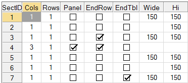
The first grid in the Advanced Layout tab displays the settings entered for each section of the layout when the template was created. The settings for the Cols, Rows, Panel, EndRow and EndTbl columns are based on the template layout selected, and changing these settings impacts the appearance of the template layout. To illustrate this, refer to the example below.
Example:
This example demonstrates how changing a setting for one section of a template can impact the other sections and affect the overall appearance of the template layout.
1.
A template is created using the following layout and settings:
2.
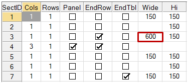
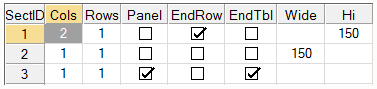
The Wide setting for SectID 3 is manually changed from 150 to 600:
3.
For this layout, changing the Wide setting not only impacts Section 3 but also impacts Section 7 because both sections are in the same column. At the same time, the width of Sections 1, 2, 5 and 6 are impacted to accommodate this change.
To further explain the advanced layout settings, refer to the template layout examples below.
Template Layout
Advanced Layout Tab Settings
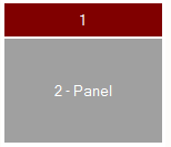
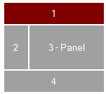
This template is made up of 2 sections:
Section 1:
This section is 1 column wide and 1 row high. Although it extends horizontally across the full width of the table, it takes up 1 column, as does the section below it. EndRow is selected because this section ends the current row.
Section 2:
This section is 1 column wide and 1 row high. Like Section 1, it extends horizontally across the full width of the table. It contains a panel. EndTbl is selected because this is the last section of the table.
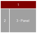
This template is made up of 3 sections:
Section 1:
This section is 2 columns wide and 1 row high. At first glance, Section 1 of this layout looks similar to Section 1 in the previous layout, but the Cols setting is different. Although this section is not visibly broken into 2 separate columns, its width extends horizontally across the full width of the 2 sections below it, which together take up 2 columns. EndRow is selected because this section ends the current row.
Section 2:
This section is 1 column wide and 1 row high. This section is at the beginning of the row; therefore, EndRow is not selected.
Section 3:
This section is 1 column wide and 1 row high. It contains a panel. EndTbl is selected because this is the last section of the table.
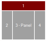
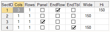
This template is made up of 4 sections:
Section 1:
This section is 3 columns wide and 1 row high. Although Section 1 of this layout looks similar to Section 1 of the previous two layouts, the Cols setting is again different. This section is not visibly broken into 3 separate columns, but its width extends horizontally across the full width of the 3 sections below it, which together take up 3 columns. EndRow is selected because this section ends the current row.
Section 2:
This section is 1 column wide and 1 row high. This section is at the beginning of the row; therefore, EndRow is not selected.
Section 3:
This section is 1 column wide and 1 row high. It contains a panel. This section is in the middle of the row; therefore, EndRow is not selected.
Section 4:
This section is 1 column wide and 1 row high. EndTbl is selected because this is the last section of the table.
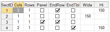
This template is made up of 4 sections:
Section 1:
This section is 2 columns wide and 1 row high. As explained earlier, this section is not visibly broken into 2 separate columns, but its width extends horizontally across the full width of the 2 sections below it, which together take up 2 columns. EndRow is selected because this section ends the current row.
Section 2:
This section is 1 column wide and 1 row high. This section is at the beginning of the row; therefore, EndRow is not selected.
Section 3:
This section is 1 column wide and 1 row high. It contains a panel. EndRow is selected because this section ends the current row.
Section 4:
This section is 2 columns wide and 1 row high. Similar to Section 1, its width extends horizontally across the full width of the 2 sections above it, which together take up 2 columns. EndTbl is selected because this is the last section of the table.
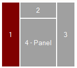
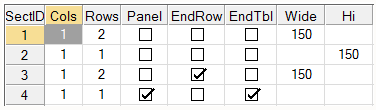
This template is made up of 4 sections:
Section 1:
This section is 1 column wide and 2 rows high. Although this section is not visibly broken into 2 separate rows, its height extends vertically to include the height of the 2 sections beside it, which together take up 2 rows. This section is at the beginning of the row; therefore, EndRow is not selected.
Section 2:
This section is 1 column wide and 1 row high. This section is in the middle of the row; therefore, EndRow is not selected.
Section 3:
This section is 1 column wide and 2 rows high, similar to Section 1. EndRow is selected because this section ends the current row.
Section 4:
This section is 1 column wide and 1 row high. Although the height of this section differs from Section 2, it is still considered a single row. It contains a panel. EndTbl is selected because this is the last section of the table.
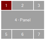
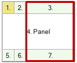
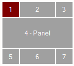
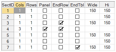
This template is made up of 7 sections:
Section 1:
This section is 1 column wide and 1 row high. This section is at the beginning of the row; therefore, EndRow is not selected.
Section 2:
This section is 1 column wide and 1 row high. This section is in the middle of the row; therefore, EndRow is not selected.
Section 3:
This section is 1 column wide and 1 row high. EndRow is selected because this section ends the current row.
Section 4:
This section is 3 columns wide and 1 row high. It contains a panel. EndRow is selected because this section ends the current row.
Section 5:
This section is 1 column wide and 1 row high. This section is at the beginning of the row; therefore, EndRow is not selected.
Section 6:
This section is 1 column wide and 1 row high. This section is in the middle of the row; therefore, EndRow is not selected.
Section 7:
This section is 1 column wide and 1 row high. EndTbl is selected because this is the last section of the table.
Section Contents
Section Contents allows you to optionally include additional contents such as Text, Images, Menus and Other parameters in the selected section of the template layout. To do this, click the Add Section Contents button beside the list box. From the popup menu, select the type of contents you are adding. When you have made your selection, a separate window with options pertaining to your selection will display. After saving the section contents, you can use the Delete, Edit and Move Up/Down buttons to the right of the Section Contents list box to remove, modify or rearrange the order of these additions.
The options for adding Text, Images, Menus and Other parameters are described below.
Text
Section Contents - Text Template
Text
Enter the text to add to the current section.
Font
Enter a font for the text.
Color
Specify a color for the text. See Color Specification for information on applying a color.
URL
Enter a URL if the text will be a hyperlink. If the text launches a Web page, enter the URL address preceded with http://.
Vertical Position
Enter a vertical position for the text. Selections are Top (default), Middle, Bottom.
Vertical Adjustment
Enter a value (in pixels) to adjust the vertical position of the text, if necessary.
Horizontal Position
Enter a horizontal position for the text. Selections are Left (default), Center, Right.
Horizontal Adjustment
Enter a value (in pixels) to adjust the horizontal position of the text, if necessary.
Image
Section Contents - Image Template
Image
Select the image to add to the current section. Click the Image browse button to select an image. If the image selected is not located under the *plus/inomads directory, you are asked if you want to copy the image file to an Images directory that will be created for that template under *plus\inomads\templates. It is a good idea to keep a copy of the image file in the template's directory so that it can be easily located and displayed when the template is applied.
Width
Enter a width for the image (in pixels). The image will be scaled to the specified height and width.
Height
Enter a height for the image (in pixels). The image will be scaled to the specified height and width.
URL
Enter a URL if the image will be a hyperlink. If the image launches a Web page, enter the URL address preceded with http://.
Vertical Position
Enter a vertical position for the image. Selections are Top (default), Middle, Bottom.
Vertical Adjustment
Enter a value (in pixels) to adjust the vertical position of the image, if necessary.
Horizontal Position
Enter a horizontal position for the image. Selections are Left (default), Center, Right.
Horizontal Adjustment
Enter a value (in pixels) to adjust the horizontal position of the image, if necessary.
Menu
Section Contents - Menu Template
Menu Name
Enter a name for the menu. To define menu content and display settings, see the Menus tab.
Define Menu
Click this button to invoke the Define Menus window for defining a new menu for the current section.
Width
Enter a width for the menu (in pixels).
Height
Enter a height for the menu (in pixels).
Vertical Position
Enter a vertical position for the menu. Selections are Top (default), Middle, Bottom.
Vertical Adjustment
Enter a value (in pixels) to adjust the vertical position of the menu, if necessary.
Horizontal Position
Enter a horizontal position for the menu. Selections are Left (default), Center, Right.
Horizontal Adjustment
Enter a value (in pixels) to adjust the horizontal position of the menu, if necessary.
Other
Section Contents - Other Template
Parameter 1 - Parameter 8
Define the parameters to be passed to the user-defined Template Definition files (similar to text.tpl, image.tpl or menu.tpl).