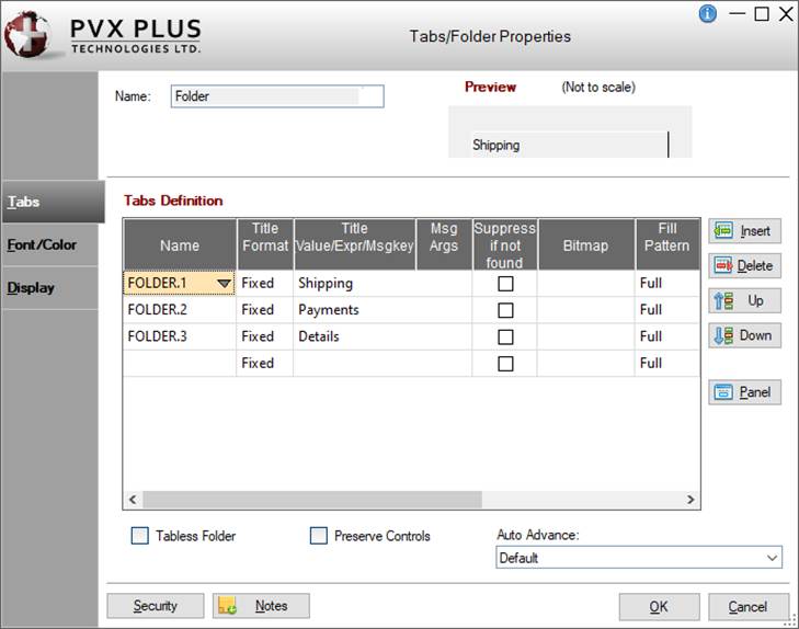
When creating or editing a Folder control, the Tabs/Folder Properties dialogue (pictured below using the Folder Style version of the NOMADS designer) is displayed:
This dialogue is divided into the following tabbed panels for viewing and/or changing tabs and Folder properties: Tabs, Font/Color and Display.
Name
Unique name of the Folder control (NOMADS provides a default). Naming conventions for variables apply. Click the Browse Library button to copy parameters from an existing object (via the Library Browse dialogue).
Preview
Displays how the visible properties of the control will appear at run time.
A tabless Folder does not have visible tabs, but only a frame surrounding the region (wizard style). See Tabless Folders.
Preserve Controls
Select this check box if the sub-panels will be using controls containing large amounts of data and there will be movement between the different Folder tabs. See Preserve Controls.
Auto Advance
Determines if focus will automatically advance to the next Folder when tabbing forward from the last control on a Folder. Click the drop-down arrow for a list of selections:
Tabbing from the last control on a Folder will proceed to the next control after the Folder on the main panel. The current Folder will not change.
Advance to next folder tab
Tabbing from the last control on a Folder will advance to the next Folder and place focus on the Folder tab. If it is the last Folder, then focus will advance to the next control after the Folder on the main panel.
Advance to first control on next folder
Tabbing from the last control on a Folder will advance to the next Folder and place focus on the first control. If it is the last Folder, then focus will advance to the next control after the Folder on the main panel.
Advance to next folder tab loop
Tabbing from the last control on a Folder will advance to the next Folder and place focus on the Folder tab. If it is the last Folder, then focus will return to the first Folder and place focus on the Folder tab, resulting in a tab loop.
(The Advance to next folder tab loop option was added in PxPlus 2021 Update 1.)
Advance to first control on next folder loop
Tabbing from the last control on a Folder will advance to the next Folder and place focus on the first control. If it is the last Folder, then focus will return to the first Folder and place focus on the first control, resulting in a tab loop.
(The Advance to first control on next folder loop option was added in PxPlus 2021 Update 1.)
(The Auto Advance option was added in PxPlus 2018.)
Font/Color
Font Specification
Font Size
Click the drop-down arrow for a list of selections.
Color
Foreground Background
Set the foreground and background colors for the folder tabs. Click the Query button to access Color Selections. Valid formats for color selections include predefined system colors (e.g. Light Red), Custom (RGB codes), HTML Hex Color Codes, User Defined colors (e.g. Color17) and string Expressions.
(The Color Selections Query button and dialog were added in PxPlus 2020.)
Attributes
Optional attributes for Bold, Italics, etc.
Tab Stop
Adds the control to the tab order list. Allows use of the Tab key for moving to the control.
Alignment
Sets the text alignment on the tabs. Click the drop-down arrow for a list of selections: Left Justify, Center and Right Justify.
Visual Class
Assign a visual class to the control.
Click the Visual Class Maintenance button to launch the Visual Classes Maintenance utility for creating or editing visual classes.
(The Visual Class Maintenance button was added in PxPlus 2019.)
iNomads Class
Assign an iNomads class to the control. The iNomads class contains class attribute references used when defining the control in the HTML code generated in iNomads. An iNomads class reference must start with an alpha character (A-Z or a-z), followed by any combination of A-Z, a-z, 0-9, underscore or dash. Multiple references may be entered, separated by a space.
Tabs placement. Click the drop-down arrow for a list of selections to indicate where the Folder tabs will be drawn on the Folder region: Top, Bottom, Left Sidebar, Left (Rotated), Right Sidebar, Right (Rotated). To move between tabs at run time, first make sure that focus is on a tab and then use the left/right or up/down arrow keys.
Uniform width to be used for all tabs. When the selected Position is Top, Bottom, Left (Rotated) or Right (Rotated), you can either enter a tab width or leave it blank. Leaving it blank will trigger NOMADS to automatically calculate the tab width by using the Folder width and the number of tabs. When the selected Position is Left Sidebar or Right Sidebar, a tab width must be entered, as NOMADS will not automatically calculate it if left blank. Format mask: ###.
Do Not Extend Tab Width When Active
(Sidebar Folders Only)
By default, active tabs extend beyond inactive tabs. When this option is selected, the active tab width stays the same width as inactive tabs.
Height
(Sidebar Folders Only)
Height of the sidebar Folder tabs. If not specified, the value of %NOMADS'SidebarFolderTabHeight will be used. If neither is set, the default height is 2.5 lines.
Flat Folder
(Not Applicable to Sidebar Folders)
This option is used only when the selected Position is Top, Bottom, Left (Rotated) and Right (Rotated). It creates a Folder control and tabs with a flat appearance.
This option is used only when the selected Position is Left Sidebar or RightSidebar. It determines the distance by which the starting line of the Folder tabs will be offset from the starting line of the Folder control.
(The Height option was added in PxPlus 2017.) (Support for up/down arrow key tab navigation was added in PxPlus 2019.) (The Do Not Extend Tab Width When Active option was added in PxPlus 2024.) (The Flat Folder option was added in PxPlus 2026 Update 1.)
Frame Style
Determines the style level and bevel sizes in creating the frame (Fixed value or numeric Expression). This is used if (at run time) only one sub-panel exists. Click the drop-down arrow for a list of Fixed selections: None, 3D Frame, Recessed Frame, Raised Frame and Top/Bottom line.
If this option is enabled and the number of sub-panels assigned to the Folder exceeds the actual Folder region, then NOMADS will determine how many tabs can be displayed and draw two scroll buttons along the Folder region. Use these buttons to display the next/prior tab.
(The Auto Advance option was added in PxPlus 2018.)
Position
Column
Starting column for the top left corner of the Folder - numeric expression. Format mask is ##0.00. Valid entries are 0 to 620.
Line
Starting line for the top left corner of the Folder - numeric expression. Format mask is ##0.00. Valid entries are 0 to 255.
(Support for increased Column and Line maximums was added in PxPlus 2021.)
Size
Width
Width of the Folder in number of columns - numeric expression. Format mask is ##0.00. Valid entries are 0 to 620.
Height
Height of the Folder in number of lines - numeric expression. Format mask is ##0.00. Valid entries are 0 to 255.
(Support for increased Width and Height maximums was added in PxPlus 2021.)
Security
Security restrictions. See Restricting Access for information on Object Security Definition.
Notes
Add notes/comments for the control. Maximum 1024 characters. These notes also display in the Wiki Help documentation for the panel. See NOMADS Wiki Help.