Button | Cell works like a button if clicked. Cell can be changed if not locked (on double click). Set the 'Lock property to 1 to achieve standard button behavior for cell. |
|---|
CheckBox | Check box with no 3D effect. |
|---|
CheckBoxRaised | 3D check box that looks raised. |
|---|
CheckBoxRecessed | 3D check box that looks recessed. |
|---|
CheckMark | Check box that uses a check mark. |
|---|
CheckMarkRaised | Raised check box that uses a check mark. |
|---|
CheckMarkRecessed | Recessed check box that uses a check mark. |
|---|
DropBox | A text cell that, when editing, allows the user to make a selection from a drop-down list. The drop list is loaded from the 'Text$ property. Drop boxes provide a multiple character search capability that makes it easier to search for an exact match in a drop box list. See Multiple Character Search. (Multiple character search in drop boxes was added in PxPlus 2019.) |
|---|
DropBoxHideBtn | Same as DropBox, but the drop-down button is shown only when focus is on the cell. Drop boxes provide a multiple character search capability that makes it easier to search for an exact match in a drop box list. See Multiple Character Search. (Multiple character search in drop boxes was added in PxPlus 2019.) |
|---|
Ellipsis | Normal text cell that will show three dots (…) if text exceeds displayable area. Ctrl - Enter can be used to force a new line in the cell (inserts $0D0A$ into cell value). |
|---|
EllipsisDrop | Same as Ellipsis, but forces the cell to drop vertically only during an edit. Ctrl - Enter can be used to force a new line in the cell (inserts $0D0A$ into cell value). |
|---|
FlatButton | A flat button that shows no visible change when clicked. (Added in PxPlus 2014 Feature Pack 1 - Update 0001) |
|---|
FlatButtonInOnly | A button that looks flat only when not depressed. (Added in PxPlus 2014 Feature Pack 1 - Update 0001) |
|---|
FlatTextButton | Similar to TextButton, but the button is flat and shows no visible change when clicked. (Added in PxPlus 2014 Feature Pack 1 - Update 0001) |
|---|
FlatTextButtonInOnly | Similar to TextButton, but the button looks flat only when not depressed. (Added in PxPlus 2014 Feature Pack 1 - Update 0001) |
|---|
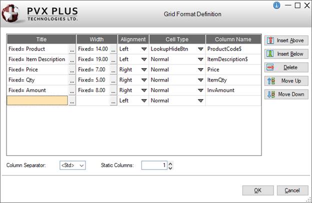
Lookup | Small button at the right side of the cell used to invoke a lookup. Button image is defined via the cell's 'Bitmap$ property. If no image is given, button shows three dots (…). |
|---|
LookupHideBtn | Same as Lookup, but indicates that the button is hidden when the cell is not selected. |
|---|
Multi_line | Normal text cell that can contain multiple lines of text. Press Enter or Ctrl - Enter to create a new line (value $0D0A$). When the cell being edited contains multiple lines of text, the Up/Down arrow keys can be used to move within the lines of text. Pressing Enter twice consecutively exits the cell being edited. (Added the use of Enter and Up/Down arrow keys when editing a cell in PxPlus 2017 Update 0004) |
|---|
Normal | Normal text cell that contains one line of data. |
|---|
Query | Same as Lookup, but the user is unable to edit the cell. |
|---|
QueryHideBtn | Same as LookupHideBtn, but the user is unable to edit the cell. |
|---|
SingleLine | Normal text cell that allows for a single line of entry, expanding the cell horizontally according to the overlap rules. It does not allow vertical expansion like a multi-line. |
|---|
TextButton | Similar to Button, except that the text on the button adheres to the 'Align$ property and will wrap. (Added in PxPlus 2014 Feature Pack 1 - Update 0001) |
|---|
UseTextEllipsis
UseTextNormal
UseTextSingleLine | Similar to Ellipsis, Normal and SingleLine respectively, except the value of 'Text$ property is displayed. During input and editing, the 'Value$ property is presented and entered into the cell. Sorting on a column is done using the 'Value$ property. To sort a date column, set the cell type to UseTextNormal, and then write a sortable value to the cell's 'Value$ property and set the 'Text$ property to the value to be displayed. |
|---|
VarDropBox | A text cell that, when editing, allows the user to make a selection from a drop-down list or enter any other value. Drop list selections are loaded using the 'Text$ property. Drop boxes provide a multiple character search capability that makes it easier to search for an exact match in a drop box list. See Multiple Character Search. (Multiple character search in drop boxes was added in PxPlus 2019.) |
|---|
VarDropBoxHideBtn | Same as VarDropBox, but the drop-down button is shown only when focus is on the cell. Drop boxes provide a multiple character search capability that makes it easier to search for an exact match in a drop box list. See Multiple Character Search. (Multiple character search in drop boxes was added in PxPlus 2019.) |
|---|