If you are new to NOMADS, you may want to start your first session by establishing a set of system defaults to use as the common starting point for future graphical user interface designs.
System defaults are maintained in the System Defaults window and stored in the PxPlus keyed file, providex.nmd. If this file does not exist when the System Defaults task is selected, you will be prompted to create this file. This file may be created in different locations for different projects, allowing projects to have different system defaults settings. Defaults may be overridden for individual libraries in Library Defaults.
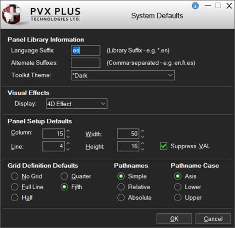
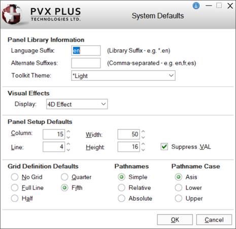
Starting with PxPlus 2024, two new modes - Dark and Light - have been created to enhance the user experience of the PxPlus Development Suite. These new modes are selected from the Toolkit Theme drop box and apply to the development toolkit on a "per project" basis. This means that if you have more than one project, you can set a different mode for each project.
To invoke this window, use one of the following methods:
Select Options > System Defaults from the menu bar.
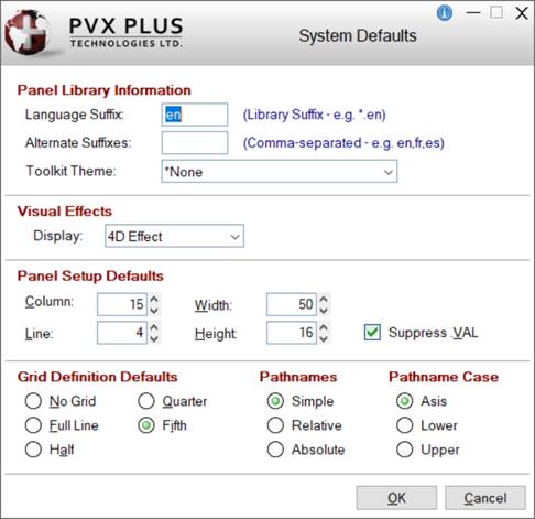
This window consists of the following:
Panel Library Information
Language Suffix
Two-character default suffix for any new libraries created (e.g. .en where all libraries created will be library_name.en). See Multilingual Capabilities.
This is also the default suffix to try when opening a generic panel library (i.e. a library with no suffix) or if the specified library fails to open. See Cascading Language Suffixes.
Alternate Suffixes
Comma-separated list of alternate suffixes to try when opening a panel library (e.g. fr,es,de,).
These suffixes will be tried when opening the originally specified library and the library with the default suffix has failed. See Cascading Language Suffixes.
If the Toolkit Theme is changed, you will be prompted to restart the PxPlus IDE to apply the new Theme when you click OK.
Click the drop down arrow for a list of predefined PxPlus Themes: *Dark, *Light, *None. (Default is *None.)
You can copy PxPlus Themes by using the Copy Theme utility. This allows you to create your own copy of these definitions and modify them for use in your application. See the tutorial How to Copy a Theme.
(The Toolkit Theme option was added in PxPlus 2024.)
*Dark
Toolkit displays with a noticeably Dark background and lighter colored controls. This gives a modern look and feel with a sharp color contrast, making controls more prominent.
Example:
*Light
Toolkit displays with a Light Gray background and slightly darker colored controls. This gives a modern look and feel with a subtle color contrast.
Example:
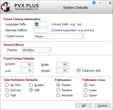
*None
No toolkit Theme is applied. Toolkit looks as it did before without any changes.
Example:
Visual Effects
Display
Visual mode that will apply to all controls (except where overridden in Library Defaults).
Click the drop down arrow for a list of selections: Default, 2D Effect, 3D Effect, 4D Effect. If not previously set, this will default to 4D Effect.
(Support to default to "4D Effect" was added in PxPlus 2024.)
Panel Setup Defaults
Column
Starting column for the top left corner of any new panels created. Format mask is -##0. Valid entries are -620 to 620.
Line
Starting line for the top left corner of any new panels created. Format mask is -##0. Valid entries are -255 to 255.
Width
Width of any new panels created in number of columns. Format mask is -##0. Valid entries are 2 to 620.
Height
Height of any new panels created in number of lines. Format mask is -##0. Valid entries are 3 to 255.
Suppress.VAL
Suppresses use of the .VAL suffix. Each panel control value is automatically placed into a variable ctl_name.VAL$.
Example:
A list box defined as LBOX_1 is found in the variable LBOX_1.VAL$ (or LBOX_1$ if .VAL is suppressed).
(Support for increased Column, Line, Width and Heights maximums was added in PxPlus 2021.)
Grid Definition Defaults
No Grid Full Line Half Quarter Fifth
These options define minimum increments for the height and location of a control when using the mouse or the Resize option in the NOMADS Panel Designer (see Panel Resizing).
Example:
If set to Full Line, the height of the control will automatically adjust (snap) to one line high when drawn and will resize in increments of one line (i.e. 2, 3, 4, etc.). Setting the grid to a smaller setting allows for finer control of resizing and movement.
Pathnames Pathname Case
(Options Not Applicable to Current Windows Systems)
OK
Saves changes and closes the System Defaults window. If the Toolkit Theme was changed, you will be prompted to restart the Plus IDE to apply the new Theme.
(The IDE restart message was added in PxPlus 2024.)
Cancel
Closes the System Defaults window without saving changes.