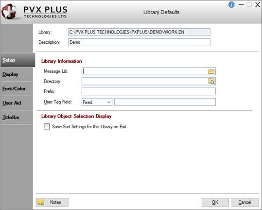
Library Defaults is used to set design defaults for panels and objects in the current library. These defaults may be overridden at any time during the design process for a specific object (e.g. within the Panel Designer).
To set defaults that will be applied to all new libraries, change the settings under System Defaults.
The NOMADS Custom Title Bar feature allows you to design your own title bar to customize the look and feel of your application. A TitleBar Option is available on the TitleBar tab in the Panel Header and in Library Defaults. In addition, a custom title bar can be applied system wide by defining the %NOMADS'TitleBar$ property. See Assigning Custom Title Bars.
(The Custom Title Bar feature was added in PxPlus 2017.)
The Library Bulk Edit and Search Utility makes it easy to apply changes to a single library or multiple libraries within a specified directory. This utility provides a convenient way to standardize the appearance of panel headers and panel controls over an entire library.
(The Library Bulk Edit Utility was added in PxPlus 2017 and renamed to Library Bulk Edit and Search in PxPlus 2023 Update 1.)
To invoke the Library Defaults window, in Library Object Selection, click the Defaults toolbar button or select Library > Library Defaults from the menu bar.
This window is divided into the following tabbed panels for viewing and/or changing Library Default settings: Setup, Display, Font/Color, User Aid and TitleBar.
(The Display and TitleBar tabs were added in PxPlus 2017.) (The Setup tab was added in PxPlus 2019.)
Library
Displays the path and name of the current library.
Description
A free-form description to identify the library.
Setup
Library Information
Message Lib
Message Library to use when processing this library. Enter the name or click the Find Message Library button to select. If the file does not exist, you will be prompted to create the file.
Directory
Default directory to use when processing an object. Enter the name or click the Get Directory button to select. Before processing an object, NOMADS changes to the directory defined in this field. When the object is closed, NOMADS switches back to your home working directory.
Prefix
Prefix to use when processing an object. Before processing an object, NOMADS changes the PxPlus PREFIX to the one defined in this field. When the object is closed, NOMADS changes back to the original PREFIX.
User Tag Field
This user-defined field can be used to pass along information for such things as formatting, error messages, and validation rules. NOMADS places the contents of this field in a variable using the control name with a .tag$ extension. Unlike the other library defaults, this field is simply a self-documenting description text and is not passed on to controls in the library.
Library Object Selection Display
Save Sort Settings for this Library on Exit
Select this check box to save the sort order for the list of objects in the current library when Library Object Selection is exited. The next time Library Object Selection is invoked for the same library, this sort order is retained. By default, this check box is not selected.
(The Save Sort Settings for this Library on Exit option was added in PxPlus 2023.)
Display
Visual Effects
Display
Sets the corresponding PxPlus mnemonic for visual mode.
Click the drop down arrow for a list of selections: Default, 2D Effect, 3D Effect, 4D Effect. If not previously set, this will default to 4D Effect. Settings cannot be overridden during the design process if set.
Default
Assumes the currently set mnemonic in PxPlus.
2D Effect
Two-dimensional look will be applied.
3D Effect
Three-dimensional look will be applied.
4D Effect
Four-dimensional look will be applied.
(Support to default the Display option to "4D Effect" was added in PxPlus 2024.)
Background Image
(NOMADS Only)
Bitmap image that displays in the background for objects in the current library. Enter the name of the image or click the Bitmap Library button to select an image.
Alignment
Alignment options for the background image. Available selections are Top Left, Centered, Tiled, Scaled.
Attributes
Full Screen Drag
(Applicable to "Dialogue" Panels)
If selected, a panel can be moved by clicking anywhere on the panel outside of the controls (as well as on the title bar) and dragging the panel to the desired location.
Available selections are Default, Always on, Always off:
Default
Use the setting in %NOMADS'Full_Screen_Drag.
Always on
The Library default is to turn on the Full Screen Drag feature (overrides the default set in %NOMADS'Full_Screen_Drag).
Always off
The Library default is to turn off the Full Screen Drag feature (overrides the default set in %NOMADS'Full_Screen_Drag).
(Full Screen Drag support in Library Defaults was added in PxPlus 2017.)
Font/Color
Font Specification
Default font for all objects in the current library.
Font
Click the drop-down arrow for a list of available fonts. <Default Graphic Font> indicates use of the graphic font defined via the PxPlus INI file or 'GF' mnemonic.
Size
Click the drop-down arrow for a list of available sizes (specific to the selected Font).
Alignment
Alignment for Fonted Text objects in the current library. Selections are Left Justify, Centre, Right Justify.
Word Wrap
Wraps text within the margins.
Attributes
Check boxes for various font attributes for text objects in the current library, including Bold, Italics, Underline All Characters and the following:
Underline &'d Chars
Underlines the first character after the &(ampersand) when displaying hot keys for text controls.
ANSI Characters
Prevents use of other character sets such as Wingdings.
Color
(NOMADS Only)
Default colors for all text regions for all objects within the current library.
Foreground Background
Click the Query button to access Color Selections. Valid formats for color selections include predefined system colors (e.g. Light Red), Custom (RGB codes), HTML Hex Color Codes, User Defined colors (e.g. Color17) and string Expressions.
(The Color Selections Query button and dialog were added in PxPlus 2020.)
Menu Color
(NOMADS Only)
Define menu colors to be used in the library. See Menu Colors to determine how to define colors and how the various colors are applied at run time.
Background
Applies a background color to the menu. Click the Query button to access Color Selections. Valid formats for color selections include predefined system colors (e.g. Light Red), Custom (RGB codes), HTML Hex Color Codes, User Defined colors (e.g. Color17) and string Expressions.
Edge
Applies a background color to the left edge portion of the menu. Click the Query button to access Color Selections. Valid formats for color selections include predefined system colors (e.g. Light Red), Custom (RGB codes), HTML Hex Color Codes, User Defined colors (e.g. Color17) and string Expressions.
Text
Applies a text color to the menu items. Click the Query button to access Color Selections. Valid formats for color selections include predefined system colors (e.g. Light Red), Custom (RGB codes), HTML Hex Color Codes, User Defined colors (e.g. Color17) and string Expressions.
Apply Menu Colors to Top Menu
Option that is used to apply the Text and Background menu colors to the top level of the menu bar. Available selections are Default, Yes, No:
Default
Use the system default setting.
Yes
Apply the colors to the top menu levels.
No
Do not apply the colors to the top menu levels.
(The renaming of the options "Item Color" to "Background" and "Edge Color" to "Edge" was added in PxPlus 2024.) (The "Text" and "Apply Menu Colors to Top Menu" options were added in PxPlus 2024.)
Theme
Assign a Theme to be applied to all panels in the current library. The Theme can be defined as a Fixed value or string Expression.
Click the Theme Maintenance button to launch the Themes Maintenance utility for creating and editing Themes.
Click the drop down arrow to select an existing Theme. Theme names that begin with an "*" (asterisk) are predefined Themes used by PVX Plus and may be subject to change without notice.
(Theme support was added in PxPlus 2017.) (The Theme Maintenance button was added in PxPlus 2019.) (The ability to select a predefined PxPlus Theme was added in PxPlus 2024.)
User Aid
Help Reference
NOMADS panels have built-in functionality that allows the user to get help via Shift - F1 while focus is on a control.
Type
Available selections are External and Internal:
External
Standard windows Help system consisting of a Help file name (.html, .hlp, .doc, etc.) and an optional keyword or reference number (fixed value or expression). Select Popup to display Help as a popup instead of an independent window.
Internal
Application supplied message text. This may be a fixed value, string expression or message library reference (pulled from a message library file rather than hard-coded).
Test
Button used for testing the current Help settings.
TitleBar
TitleBar Option
(NOMADS Only)
Set the default TitleBar option for the library. See Custom Title Bars.
Available selections are Default, TitleBar and None:
Default
Use the current default Title Bar setting for the library panels.
TitleBar
Use the panel defined in Panel Information as the default Title Bar for the library.
None
The Library default is to not use a Title Bar on the library panels.
(TitleBar support was added in PxPlus 2017.)
Panel Information
(Available when TitleBar Option is TitleBar)
Fixed or Expression
The Custom Title Bar panel information can be entered as a Fixed value or as an Expression:
If Fixed, enter the Library and Panel information (explained below). If the information is an expression, select Expression from the drop-down list and enter an expression that can be evaluated to a value consisting of the panel name and library, separated by a comma; e.g. PanelName,LibraryName.
Library
Enter the path to the library containing the Title Bar panel definition. Click the drop-down arrow to invoke a list of recently used libraries. Click the Browse button to look through the directory structure to find the library. Be sure to use the simplest form of the path for your application.
Panel
Name of the panel definition to use as the Title Bar for the panel. Click the drop-down arrow to invoke a list of all panels in the library.
Notes
Add notes/comments about the library. Maximum 1024 characters.