How to Apply Rounded Corners to Controls (NOMADS)
PxPlus 2026 introduced the Corner Radius property, which lets you round the corners of panel controls instead of leaving them square, for a more modern look.
This tutorial shows how to apply the Corner Radius property, one control at a time. The Client Master File Maintenance panel will be used as a working example. It contains buttons, drop boxes, multi-lines, and a check box, so you can see how rounding affects a range of control types. This tutorial does not include the creation of the panel itself. Instead, it starts with the existing panel and then applies the Corner Radius property to selected controls. The panel is then compared before and after these changes so you can see the difference rounding makes to the panel's appearance.
Corner rounding is controlled by the Corner Radius property for most controls, with two exceptions: check boxes and radio buttons.
A standard check box (with no bitmap) uses a dedicated Check Box Corner Radius property instead. Once a bitmap is added, the check box takes on the appearance and behavior of a button, and its rounding is then controlled by its own Button Corner Radius property.
A standard radio button (with no bitmap) is always round and has no Corner Radius property. Once a bitmap is added, the radio button takes on the appearance and behavior of a button, and its rounding is then controlled by its own Button Corner Radius property. Radio buttons are not covered in this tutorial.
Most list box types, except Report View and Variable List Box, also support corner rounding via the Corner Radius property. List boxes are not covered in this tutorial.
The table below summarizes this information based on control type:
Control Type | Property | Accepted Values |
Button | Corner Radius | (Null), Round, Square, or a value from 0 to 255 |
Multi-Line | Corner Radius | (Null), Round, Square, or a value from 0 to 7 |
Drop Box and Variable Drop Box | Corner Radius | (Null), Round, Square, or a value from 0 to 3 |
Check Box (with a bitmap - behaves like a button) | Button Corner Radius | (Null), Round, Square, or a value from 0 to 255 |
Check Box (with no bitmap - standard check box) | Check Box Corner Radius | (Null), Round, Square, or a value from 0 to 255 |
List Box (all types except Report View and Variable List Box) | Corner Radius | (Null), Round, Square, or a value from 0 to 8 |
Radio Button (with a bitmap - behaves like a button) | Button Corner Radius | (Null), Round, Square, or a value from 0 to 255 |
Radio Button (with no bitmap - standard radio button) | Not Applicable | Always Round |
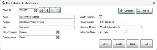
Before:
This screenshot shows the panel before applying rounded corners:
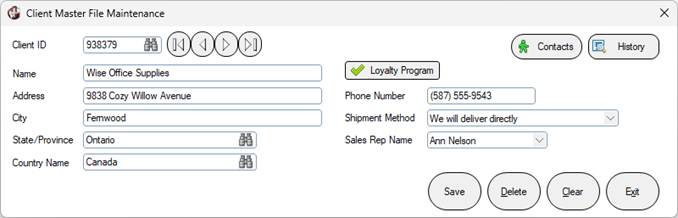
After:
This screenshot shows the completed panel after applying rounded corners to selected controls:
How to Apply Corner Radius to Multi-Lines
These steps show how to apply Corner Radius to multi-lines. The Client Master File Maintenance panel contains the following multi-lines: Client ID, Name, Address, City, State/Province, Country Name, and Phone Number.
1. | Launch the NOMADS Panel Designer. (This tutorial is using the NOMADS+ version of the designer.) |
2. | Double click the Client ID multi-line. |
3. | The Multi-Line Properties window opens. Click the Attributes tab. |
4. | Locate the Corner Radius drop-down field. |
5. | Hover the mouse pointer over the yellow info tip icon to see more information about the acceptable values for multi-lines. 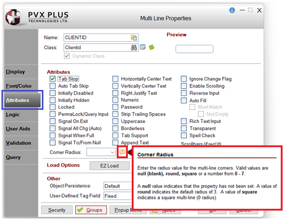 |
6. | A Corner Radius value can be specified by entering a number directly in the field or by selecting Round or Square from the drop-down. Select Round. 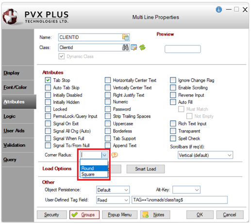 |
7. | Click OK to save. The Multi-Line Properties window closes. |
8. | In the toolbar, click Save and then click Test to review the panel.  |
9. | The test panel looks like this: 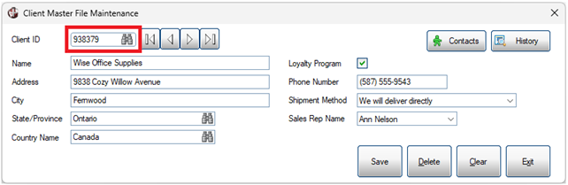 Notice that the Client ID multi-line has rounded corners. |
10. | Close the test panel. |
11. | Repeat steps 3 to 7 above to set the Corner Radius property to Round for each of the remaining multi-lines: Name, Address, City, State/Province, Country Name, and Phone Number. |
12. | When done, click Save and then click Test to review the panel. |
13. | The test panel looks like this: 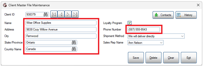 Notice that the multi-lines now have rounded corners. |
14. | Close the test panel. |
How to Apply Corner Radius to Drop Boxes
These steps show how to apply Corner Radius to drop boxes. The Client Master File Maintenance panel contains the following drop boxes: Shipment Method and Sales Rep Name.
1. | Launch the NOMADS Panel Designer. (This tutorial is using the NOMADS+ version of the designer.) |
2. | Double click the Shipment Method drop box. |
3. | The Drop Box Properties window opens. Click the Attributes tab. |
4. | Locate the Corner Radius drop-down field. |
5. | Hover the mouse pointer over the yellow info tip icon to see more information about the acceptable values for drop boxes. 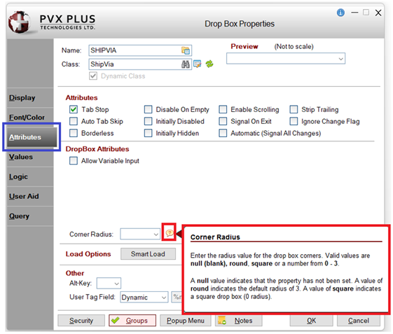 |
6. | A Corner Radius value can be specified by entering a number directly in the field or by selecting Round or Square from the drop-down. Select Round. 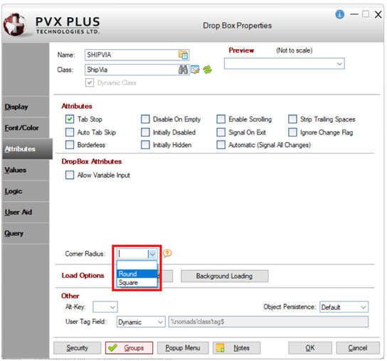 |
7. | Click OK to save. The Drop Box Properties window closes. |
8. | In the toolbar, click Save and then click Test to review the panel. |
9. | The test panel looks like this: 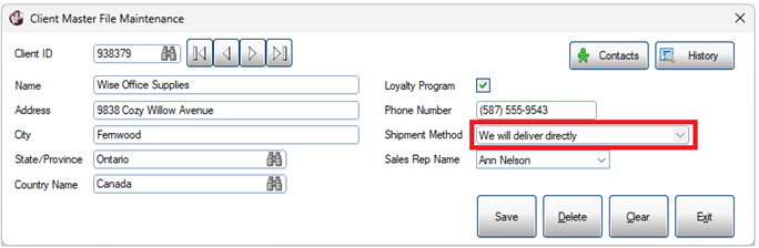 Notice the rounded corners of the Shipment Method drop box compared with the square corners of the Sales Rep Name drop box. |
10. | Close the test panel. |
11. | Repeat steps 3 to 7 above to set the Corner Radius property to Round for the Sales Rep Name drop box. |
12. | When done, click Save and then click Test to review the panel: 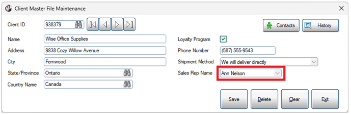 Notice that the Sales Rep Name drop box now has rounded corners. |
13. | Close the test panel. |
How to Apply Corner Radius to Check Boxes
These steps show how to apply Corner Radius to check boxes. The Client Master File Maintenance panel contains one check box: Loyalty Program.
1. | Launch the NOMADS Panel Designer. (This tutorial is using the NOMADS+ version of the designer.) |
2. | Double click the Loyalty Program check box. |
3. | The Check Box Properties window opens. Click the Attributes tab. |
4. | Locate the Check Box Corner Radius drop-down field. |
5. | Hover the mouse pointer over the yellow info tip icon to see more information about the acceptable values for check boxes. 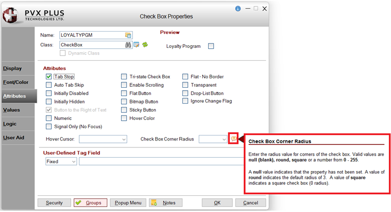 |
6. | A Corner Radius value can be specified by entering a number directly in the field or by selecting Round or Square from the drop-down. Select Round. 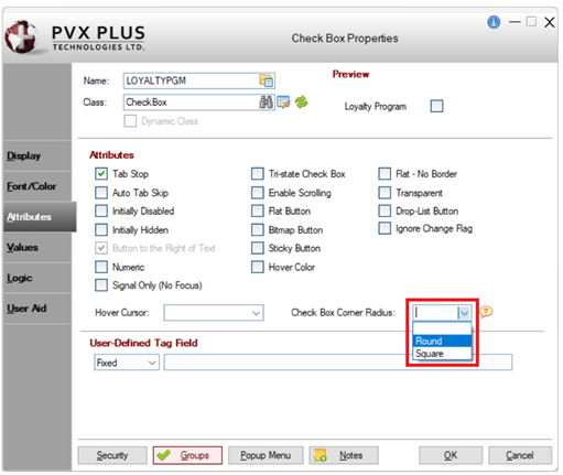 |
7. | Click OK to save this change. The Check Box Properties window closes. |
8. | In the toolbar, click Save and then click Test to review the panel. |
9. | The test panel looks like this: 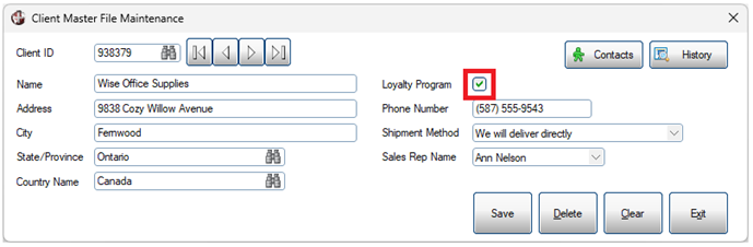 Notice that the Loyalty Program check box now had rounded corners. |
10. | Taking this one step further, add a bitmap to the Loyalty Program check box. Adding a bitmap to a check box changes it to a button. Double click the Loyalty Program check box to open the Check Box Properties window. |
11. | Locate the Bitmaps section on the Display tab. A bitmap can be added to either the Off State or On State, or to both. For this example, add a bitmap to the On State only. 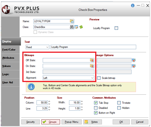 |
12. | Click the Bitmap Library button within the On State field. The Bitmaps window opens. |
13. | Select any bitmap and click OK. The Bitmaps window closes. |
14. | The selected bitmap is shown in the On State field. 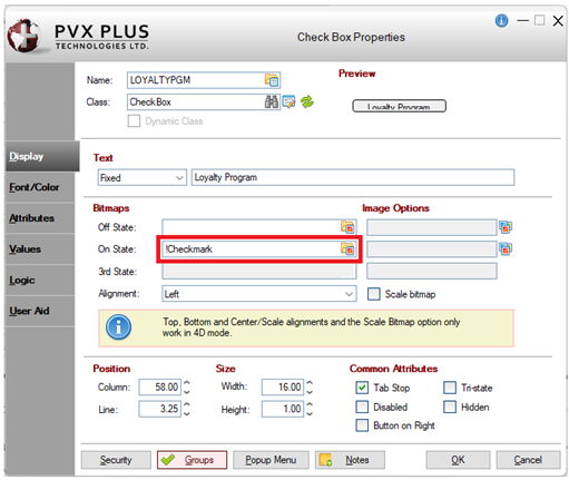 |
15. | After adding a bitmap, the Preview area in the top right corner is showing that the check box needs size adjustments. This is done on the Display tab. Locate the Height field and increase this value so that the entire bitmap displays properly. With the check box now bigger, it needs to be moved up so it does not touch the field below it. Locate the Line field and decrease this value. |
16. | Click the Attributes tab. Because a bitmap has been added, the Check Box Corner Radius property has changed to Button Corner Radius. |
17. | A Button Corner Radius value can be specified by entering a number directly in the field or by selecting Round or Square from the drop-down. Select Round. 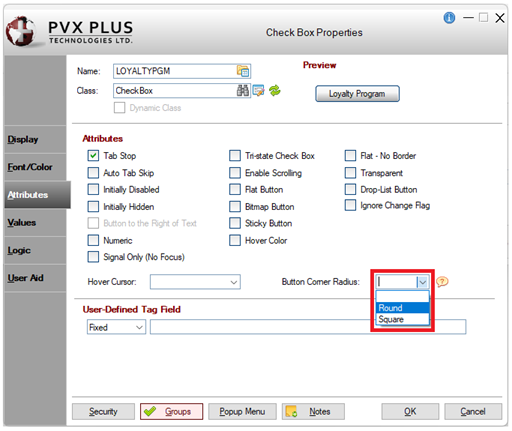 |
18. | Click OK to save this change. The Check Box Properties window closes. |
19. | In the toolbar, click Save and then click Test to review the panel. |
20. | The test panel looks like this: 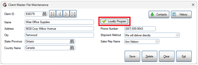 Notice that the Loyalty Program check box now has a bitmap and rounded corners. |
21. | Close the test panel. |
22. | To revert the Loyalty Program check box to a standard check box, click the Undo button in the NOMADS+ toolbar or close the Panel Designer without saving these changes. |
How to Apply Corner Radius to Buttons
These steps show how to apply Corner Radius to buttons. The Client Master File Maintenance panel contains Contacts and History buttons, action buttons, and browse buttons.
For this example, Corner Radius will be set to a numeric value instead of Round.
1. | Launch the NOMADS Panel Designer. (This tutorial is using the NOMADS+ version of the designer.) |
2. | Double click the Contacts button. |
3. | The Button Properties window opens. Click the Attributes tab. |
4. | Locate the Corner Radius drop-down field. |
5. | Hover the mouse pointer over the yellow info tip icon to see more information about the acceptable values for buttons. 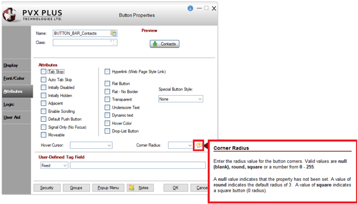 |
6. | A Corner Radius value can be specified by entering a number directly in the field or by selecting Round or Square from the drop-down. Enter 10. 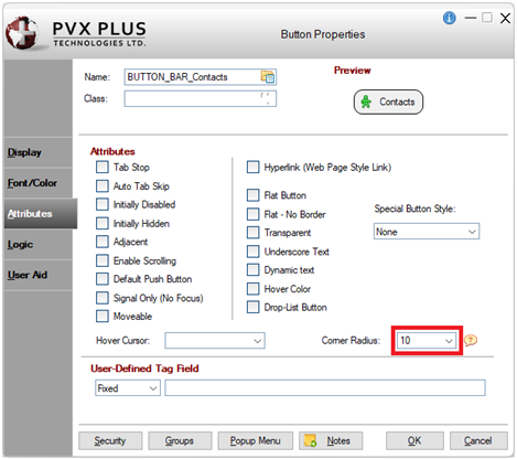 |
7. | Click OK to save this change. The Button Properties window closes. |
8. | In the toolbar, click Save and then click Test to review the panel. |
9. | The test panel looks like this: 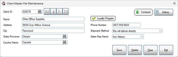 Notice that the corners of the Contacts button are more rounded. |
10. | Repeat steps 3 to 7 above to set the Corner Radius property to 10 for the History button. |
11. | When done, click Save and then click Test to review the panel. |
12. | The test panel looks like this: 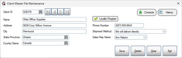 |
13. | Repeat these steps to set the Corner Radius to 10 for each of the action buttons: Save, Delete, Clear and Exit. |
14. | When done, click Save and then click Test to review the panel. |
15. | The test panel looks like this: 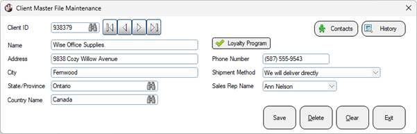 Notice the corner rounding for the action buttons. |
16. | Close the test panel. |
17. | For the four action buttons, change the Corner Radius setting from 10 to 255 (maximum). |
18. | When done, click Save and then click Test to review the panel. |
19. | The test panel looks like this: 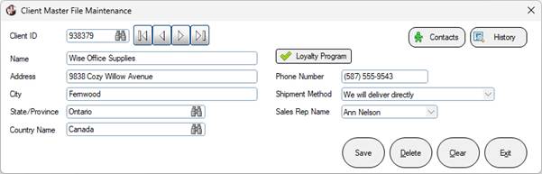 Notice that the corner rounding for the action buttons is more noticeable with the higher Corner Radius value. |
20. | Close the test panel. |
21. | Repeat the steps above to set the Corner Radius for the four browse buttons to 255. |
22. | When done, click Save and then click Test to review the panel. |
23. | The test panel looks like this: |
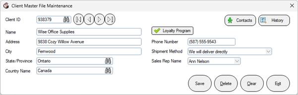 Notice that with the smaller browse buttons, the corner rounding makes the buttons more circular. | |
24. | Close the test panel. |
You can apply these same steps to round the corners of individual controls on any of your own panels. By using different Corner Radius settings, you can adjust the appearance of individual controls to suit your application.
See Also
How to Apply Rounded Corners to Controls (Themes and Visual Classes)
How to Apply Rounded Corners to Controls (Non-NOMADS)