How to Apply Rounded Corners to Controls (Themes and Visual Classes)
PxPlus 2026 introduced the Corner Radius property, which lets you round the corners of panel controls instead of leaving them square, for a more modern look.
This tutorial shows how Themes and Visual Classes can be used together to apply rounded corners and other visual attributes to controls, giving your application a fresh, modern look. They provide an efficient way to apply a consistent appearance to controls without having to modify each control individually.
The Client Master File Maintenance panel will be used as a working example. It contains buttons, drop boxes, multi-lines, and a check box. This tutorial does not include the creation of the panel itself. Instead, it starts with the existing panel, applies a Theme, and then applies Visual Classes to selected controls. The panel is then compared before and after these changes.
Corner rounding is controlled by the Corner Radius property for most controls, with two exceptions: check boxes and radio buttons.
A standard check box (with no bitmap) uses a dedicated Check Box Corner Radius property instead. Once a bitmap is added, the check box takes on the appearance and behavior of a button, and its rounding is then controlled by its own Button Corner Radius property.
A standard radio button (with no bitmap) is always round and has no Corner Radius property. Once a bitmap is added, the radio button takes on the appearance and behavior of a button, and its rounding is then controlled by its own Button Corner Radius property. Radio buttons are not covered in this tutorial.
Most list box types, except Report View and Variable List Box, also support rounded corners via the Corner Radius property. List boxes are not covered in this tutorial.
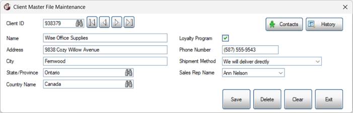
Before:
This screenshot shows the panel before Corner Radius is applied:
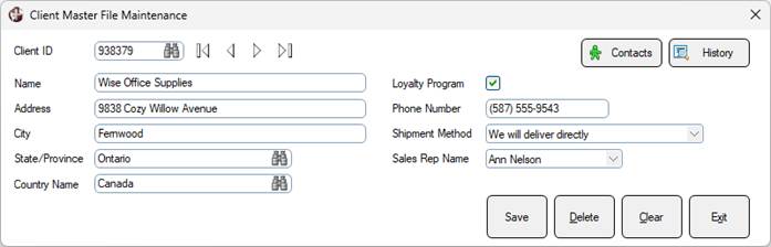
After (Theme applied only)
This screenshot shows the panel after applying the Round Theme only. This Theme applies rounded corners to the buttons, drop boxes, multi-lines and check box on this panel.
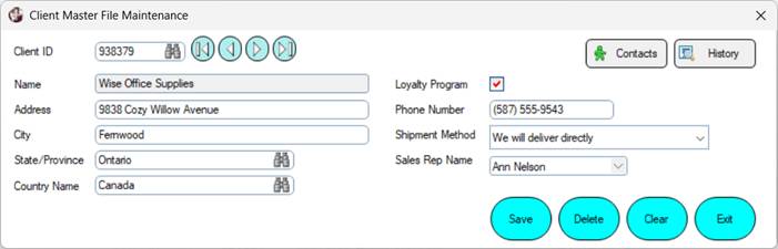
After (Theme + Visual Classes applied)
This screenshot shows the completed panel after applying individual Visual Classes to selected controls, in addition to the Round Theme.
Create the Theme
For this example, a Theme called Round will be created to establish rounded corners for the buttons, drop boxes, multi-lines and check box on this panel.
1. | Launch the PxPlus IDE. Expand the Graphical Application Builder (NOMADS) category. Expand the Setup category and double click on Themes. |
2. | The Themes window opens. For the Theme name, enter Round. For Control Type, select Button. |
3. | Under the Attributes category, locate the Corner Radius property. Enter 5. 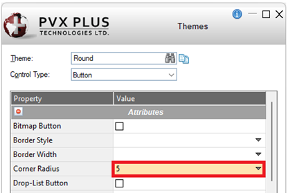 |
4. | Click the Write button to save. A confirmation message displays. Click OK. |
5. | Leave the Theme name as Round. For Control Type, select Check_Box. |
6. | Under the Attributes category, locate the CB Corner Radius property. Enter 2. 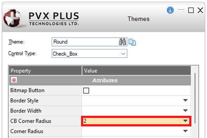 |
7. | Click the Write button. |
8. | Leave the Theme name as Round. For Control Type, select Drop_Box. |
9. | Under the Attributes category, locate the Corner Radius property. Enter 3. 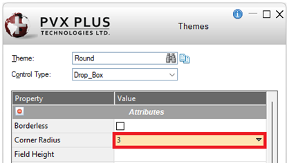 |
10. | Click the Write button. |
11. | Leave the Theme name as Round. For Control Type, select Multi_Line. |
12. | Under the Attributes category, locate the Corner Radius property. Enter 5. 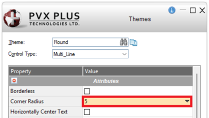 |
13. | Click the Write button. |
14. | Click the Exit button to close the Themes window. |
In the next section, the Round Theme will be applied to the panel to see its effect on the controls.
Apply the Theme
A Theme can be assigned at different levels within a NOMADS application, such as in your START_UP program or in Library Defaults (Font/Color tab). See Applying a Theme to Your Application.
For this example, the Round Theme will be applied directly to the Client Master File Maintenance panel at the Panel Header level.
1. | Launch the NOMADS Panel Designer for the panel to which the defined Theme will be applied. (This tutorial is using the NOMADS+ version of the designer.) |
2. | Click the Header Panel button in the toolbar or select Panel > Header from the menu bar.  |
3. | The Panel Definition window opens. Click the Font/Color tab. |
4. | Locate the Theme section. Click the drop-down and select Round. Click OK. 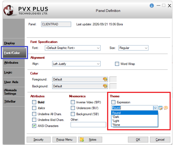 |
5. | In the toolbar, click Save and then click Test to review the panel.  |
6. | The test panel looks like this: 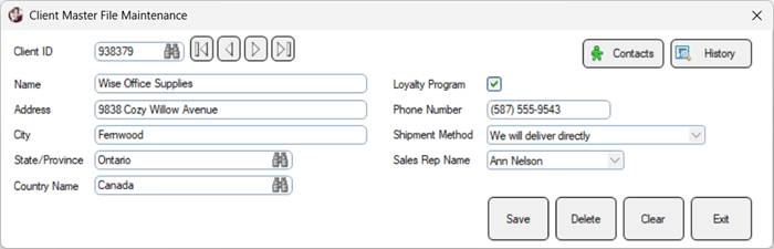 |
7. | The buttons, check box, drop boxes and multi-lines now have rounded instead of square corners. |
8. | Close the test panel but do not exit the NOMADS Panel Designer. |
In this example, the Round Theme establishes the general appearance of the controls on the panel. Visual Classes can then be used to override that appearance for selected controls, as demonstrated in the next sections.
Create the Visual Classes
For this example, create Visual Classes for the following control types: button, check box, drop box and multi-line.
Each Visual Class will specify different attributes. In the next section, these Visual Classes will be applied to selected controls, demonstrating how a Visual Class can supplement or override the appearance established by the Round Theme.
Create Button Visual Classes
1. | From the PxPlus IDE, expand the Graphical Application Builder (NOMADS) category and then expand the Setup category. Double click on Visual Classes. |
2. | The Visual Classes window opens. Create a Button Visual Class called Action Button. Enter the following details: Class Name: Action Button (Name for the Visual Class) 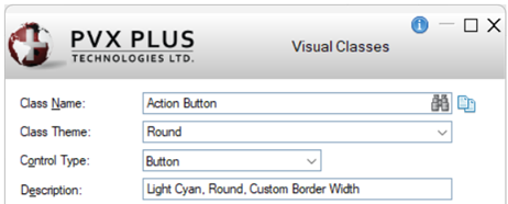 |
3. | Under the Attributes category, set the following properties: Border Width: Click the drop-down and select 1. 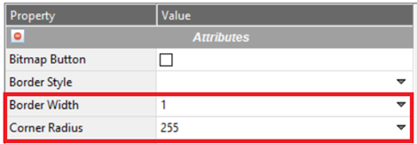 |
4. | Under the Colors category, set the following property: Background Color: Click the dotted button to open the Color Selections window. Under Standard, select Light Cyan. Click OK.  |
5. | Click the Write button to save. A confirmation message displays. Click OK. |
6. | Create a second Button Visual Class. Click the Clear button to clear the fields. The Visual Classes window stays open. |
7. | Enter the following details: 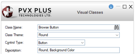 |
8. | Under the Colors category, set the following property: Background Color: Click the dotted button to open the Color Selections window. The desired color is a Hex Color Code. Under HTML Hex Color Code, select Pale Turquoise (#AFEEEE). Click OK.  |
9. | Click the Write button. |
10. | Click the Clear button. The fields are cleared, and the Visual Classes window stays open. |
Create a Check Box Visual Class
1. | With the Visual Classes window open, create a Check Box Visual Class called Check Box Square. Enter the following details: 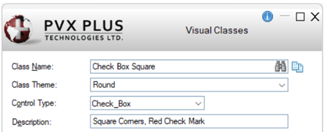 |
2. | Under the Attributes category, set the following property: CB Corner Radius: Click the drop-down and select Square. 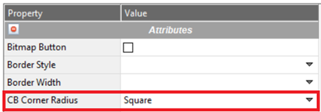 |
3. | Under the Colors category, set the following property: CB Mark Color: Click the dotted button to open the Color Selections window. Under Standard, select Light Red. Click OK. 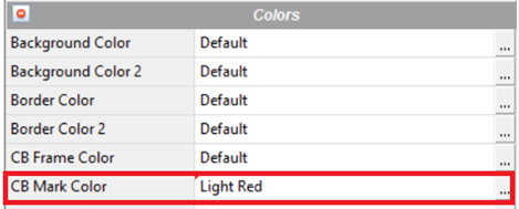 |
4. | Click the Write button. |
5. | Click the Clear button. The fields are cleared, and the Visual Classes window stays open. |
Create a Drop Box Visual Class
1. | With the Visual Classes window open, create a Drop Box Visual Class called Drop Box Input. Enter the following details: 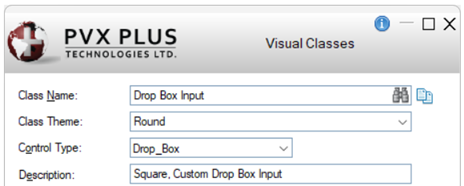 |
2. | Under the Attributes category, set the following properties: Corner Radius: Click the drop-down and select Square. 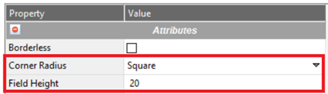 |
3. | Click the Write button. |
4. | Click the Clear button. The fields are cleared, and the Visual Classes window stays open. |
Create a Multi-Line Visual Class
1. | With the Visual Classes window open, create a Multi-Line Visual Class called MultiLine Round Light Gray. Enter the following details: 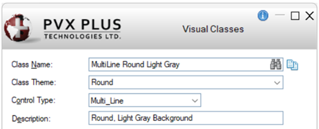 |
2. | Under the Attributes category, set the following property: Corner Radius: Enter 3. 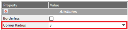 |
3. | Under the Colors category, set the following property: Background Color: Click the dotted button to open the Color Selections window. Under Standard, select Light Gray. Click OK.  |
4. | Click the Write button. |
5. | No other Visual Classes need to be defined for this example. Click the Exit button to close the Visual Classes window. |
In the next section, these Visual Classes will be applied to specific controls.
Apply the Visual Classes
Apply the Button Visual Classes
Apply the button Visual Class called Action Button to the Save, Delete, Clear and Exit buttons.
1. | In the NOMADS Panel Designer, double click the Save button. |
2. | The Button Properties window opens. Click the Font/Color tab. |
3. | Locate the Visual Class section. Click the drop-down and select Action Button. Click OK. 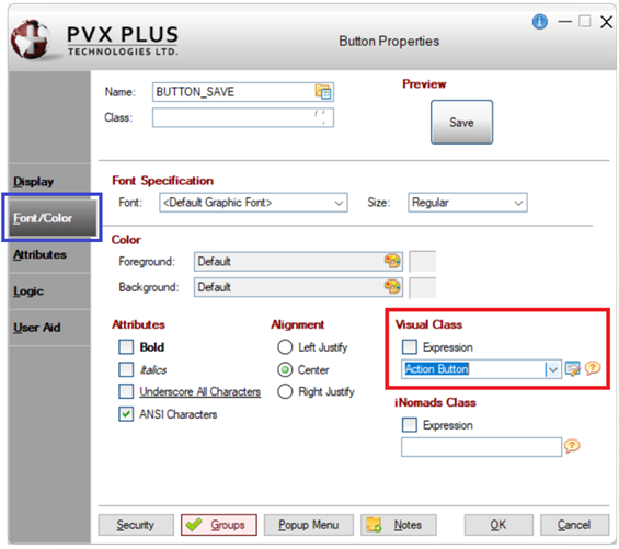 |
4. | Repeat steps 1 to 3 to apply this Visual Class to the Delete, Clear and Exit buttons. |
5. | In the toolbar, click Save and then click Test to review the panel.  |
6. | The test panel looks like this: 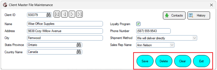 Notice how the Action Button Visual Class changes the appearance of the four buttons. |
7. | Close the test panel. |
Apply the button Visual Class called Browse Button to each of the four browse buttons beside the Client ID field.
1. | In the NOMADS Panel Designer, double click the first browse button. |
2. | The Button Properties window opens. Click the Font/Color tab. |
3. | In the Visual Class section, click the drop-down and select Browse Button. Click OK. |
4. | Repeat steps 1 to 3 to apply this Visual Class to the second, third and fourth browse buttons. |
5. | Click the Save toolbar button and then click Test to review the panel. |
6. | The test panel looks like this: 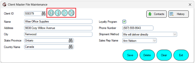 Notice how the Browse Button Visual Class changes the appearance of the four browse buttons. |
7. | Close the test panel. |
Apply the Check Box Visual Class
Apply the check box Visual Class called Check Box Square to the Loyalty Program check box.
1. | In the NOMADS Panel Designer, double click the Loyalty Program check box. |
2. | The Check Box Properties window opens. Click the Font/Color tab. |
3. | In the Visual Class section, click the drop-down and select Check Box Square. Click OK. 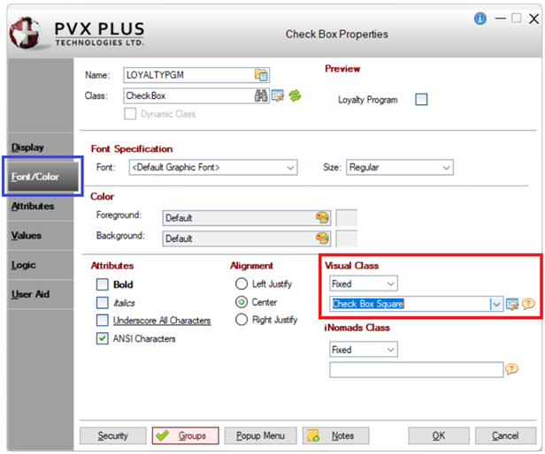 |
4. | Click the Save toolbar button and then click Test to review the panel. |
5. | The test panel looks like this: 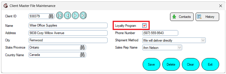 Notice how the Loyalty Program check box now has square corners, overriding the rounded corners applied by the Round Theme. |
6. | Close the test panel. |
Apply the Drop Box Visual Class
Apply the drop box Visual Class called Drop Box Input to the Shipment Method drop box only.
1. | In the NOMADS Panel Designer, double click the Shipment Method drop box. |
2. | The Drop Box Properties window opens. Click the Font/Color tab. |
3. | In the Visual Class section, click the drop-down and select Drop Box Input. Click OK. 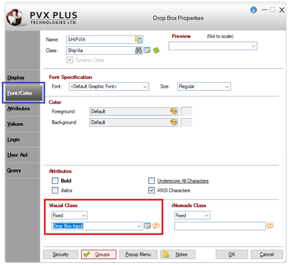 |
4. | Click the Save toolbar button and then click Test to review the panel. |
5. | The test panel looks like this: 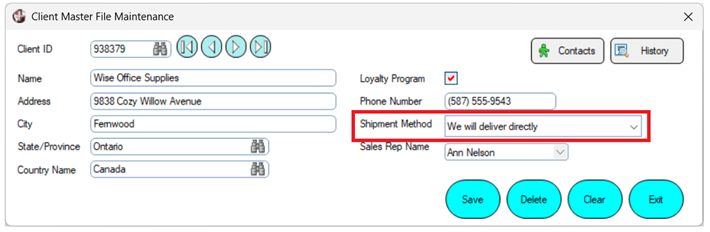 Notice that the Shipment Method drop box now has square corners and a different field height. The square corners override the rounded corners applied by the Round Theme: 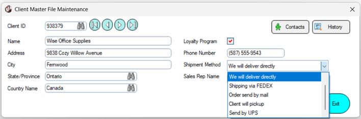 |
6. | Close the test panel. |
Apply the Multi-Line Visual Class
Apply the multi-line Visual Class called MultiLine Round Light Gray to the Name multi-line.
1. | In the NOMADS Panel Designer, double click the Name multi-line. |
2. | The Multi-Line Properties window opens. Click the Font/Color tab. |
3. | In the Visual Class section, click the drop-down and select MultiLine Round Light Gray. Click OK. 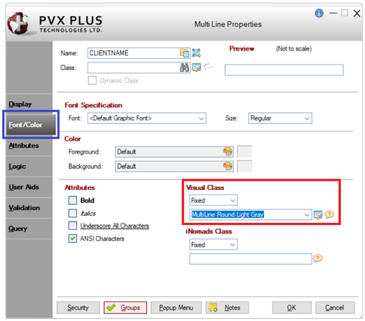 |
4. | Click the Save toolbar button and then click Test to review the panel. |
5. | The test panel looks like this: 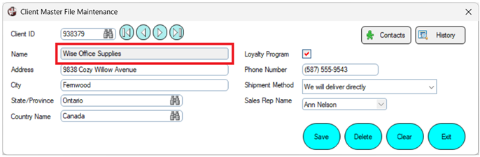 Notice how the Name multi-line differs from the Address and City multi-lines. The Visual Class applies a Light Gray background and changes the Corner Radius established by the Round Theme to make the corners less rounded. |
6. | Close the test panel. |
This example shows how Themes and Visual Classes can be used together to give controls a consistent, modern appearance without having to modify each control individually.
The Theme establishes the common rounded appearance, while Visual Classes apply additional attributes or selectively override the Theme for particular controls. For example, some of the Visual Classes use square corners to override the rounded corners established by the Theme.
Once created, Themes can be copied to other directories using the Copy Theme utility, along with any related Visual Classes.
See Also
Copy Theme Utility
How to Copy a Theme
How to Apply Rounded Corners to Controls (NOMADS)
How to Apply Rounded Corners to Controls (Non-NOMADS)